Patient Satisfaction Dashboard
Monitor the metrics that matter most to your patients.
What is a Patient Satisfaction Dashboard?
A patient satisfaction dashboard centralizes the KPIs healthcare organizations need to monitor patient experience and operational performance in one place.
When patients leave a clinic or hospital, their experience is shaped by dozens of factors: how long they waited, how clearly staff communicated, whether test results came back quickly, and how smoothly the discharge process went. Tracking any one of those factors in isolation gives you a partial picture. A patient satisfaction dashboard pulls them together so your team can see what's working, what isn't, and where to act.
For healthcare leaders, this kind of centralized visibility isn't a luxury. It's how you move from reactive problem-solving to proactive quality improvement.
Why patient satisfaction data matters
Patient satisfaction is both a quality indicator and an operational signal. High satisfaction scores tend to correlate with better clinical outcomes, stronger staff performance, and lower readmission rates. Low scores, on the other hand, often point to systemic problems: bottlenecks in patient flow, communication gaps between departments, or understaffed shifts that stretch wait times.
The challenge is that patient satisfaction data lives in many places. Survey responses come from one system. Wait time data comes from another. Lab results from a third. Without a dashboard to consolidate these sources, healthcare managers are left reconciling spreadsheets instead of making decisions.
A well-built patient satisfaction dashboard solves this by connecting your data sources and presenting KPIs in a consistent, real-time view your entire team can reference.
Key KPIs for your patient satisfaction dashboard
The metrics below give healthcare teams a clear, actionable view of both operational performance and patient experience:
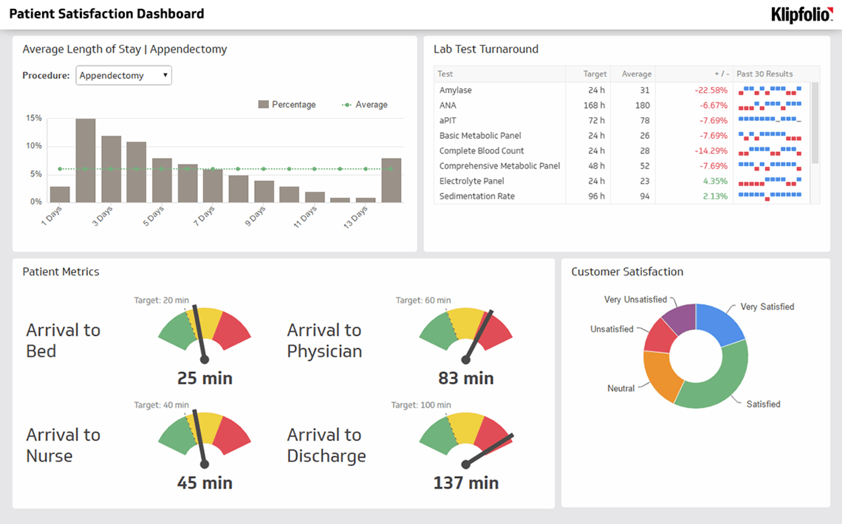
Average Length of Stay: This metric tracks the average time a patient spends in the hospital. Monitoring this KPI helps identify inefficiencies in patient flow, discharge planning, and bed management. A rising average can signal capacity issues before they become crises.
Lab Turnaround Time: This measures the time it takes to process lab tests from sample collection to result delivery. Faster turnaround supports quicker diagnoses, shorter stays, and better patient outcomes. Delays here often ripple into wait times and satisfaction scores.
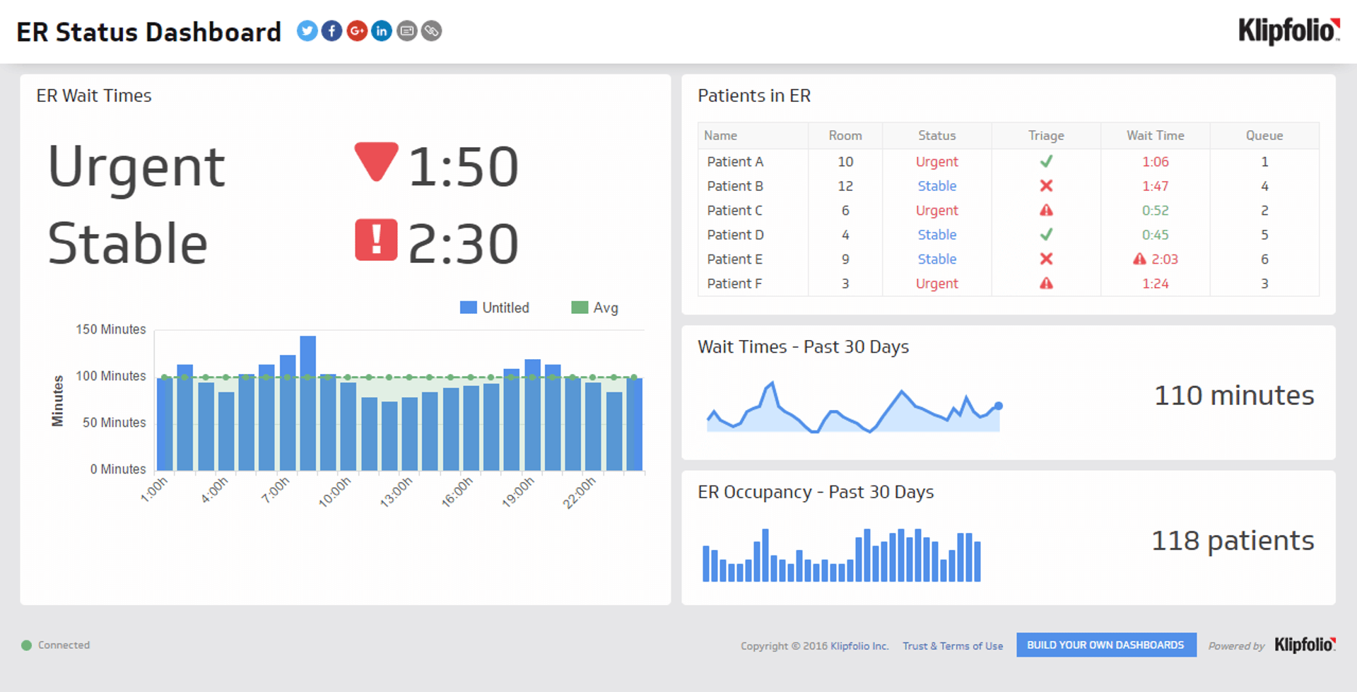
ER Wait Time: This tracks the time from when a patient arrives at the emergency room to when they are seen by a physician. It's a critical metric for both patient satisfaction and operational efficiency. Long ER wait times are one of the most common drivers of negative patient feedback. For a real-world example of ER wait time monitoring, explore the ER Status Dashboard.
Patient Satisfaction Score (CSAT): Often measured through post-visit surveys, this score provides direct feedback on the patient experience, from quality of care to communication with staff. Tracking CSAT over time helps you identify trends, benchmark performance, and measure the impact of operational changes.
These four metrics work together. A spike in ER wait times often precedes a dip in CSAT scores. A slowdown in lab turnaround can extend average length of stay. Seeing these KPIs side by side makes the relationships visible and gives your team the context to act.
What to include in a patient satisfaction dashboard
Beyond the core KPIs, a strong patient satisfaction dashboard typically includes:
Patient volume by department or unit: Understanding where demand is concentrated helps you allocate staff and resources more effectively.
Staff-to-patient ratios: Understaffing is one of the fastest paths to declining satisfaction scores. Monitoring this metric alongside CSAT helps you connect the dots.
Readmission rates: High readmission rates often indicate gaps in discharge planning or follow-up care. Tracking this alongside satisfaction data gives you a fuller picture of care quality.
Net Promoter Score (NPS): Some healthcare organizations supplement CSAT with NPS to measure whether patients would recommend their facility to others. This is a useful leading indicator of long-term reputation.
Appointment wait times: Distinct from ER wait times, this tracks how long patients wait for scheduled visits. Long waits for routine care are a common source of dissatisfaction.
The exact mix of metrics depends on your organization's priorities, but the goal is the same: a single view that connects operational data with patient feedback so your team can identify problems early and respond with confidence.
How to build a patient satisfaction dashboard
Building an effective dashboard starts with knowing what questions you need to answer. Are you trying to reduce ER wait times? Improve discharge efficiency? Benchmark satisfaction scores across departments? Your primary question should drive which metrics you prioritize and how you structure the layout.
From there, the process looks like this:
- Identify your data sources. Patient satisfaction data typically comes from survey platforms, EHR systems, lab information systems, and scheduling software. Know where your data lives before you start building.
- Connect your sources. A dashboard tool like Klipfolio Klips connects to 100+ data sources via APIs, SQL, and cloud storage, so you can pull all your metrics into one place without manual exports.
- Choose your KPIs. Start with the core metrics outlined above, then layer in department-specific indicators as needed.
- Design for your audience. Executives need high-level trend lines. Department managers need granular, real-time data. Build views that match how each audience actually uses the information.
- Set refresh rates. Some metrics, like ER wait times, need near-real-time updates. Others, like monthly CSAT scores, can refresh daily or weekly. Match your refresh rate to the urgency of the data.
- Share and distribute. A dashboard only adds value if the right people can see it. Use role-based access, TV mode for waiting areas and staff stations, or scheduled PDF reports for leadership.
Common pitfalls to avoid
Even well-intentioned dashboards can fall short if they're built without a clear purpose. A few patterns to watch for:
Too many metrics: A dashboard with 20 KPIs is harder to act on than one with six well-chosen ones. Prioritize metrics that directly connect to decisions your team makes.
Stale data: If your dashboard isn't refreshing frequently enough, your team loses trust in it. Set refresh rates that match the pace of your operations.
No context for the numbers: A CSAT score of 78% means very little without a benchmark or trend line. Always show metrics in context, whether that's a target, a historical average, or a department comparison.
Siloed access: If only one person can see the dashboard, it loses most of its value. Distribute access to the teams who can actually act on the data.
Turning patient satisfaction data into action
A dashboard shows you what's happening. What you do next determines whether it changes anything.
Healthcare organizations that get the most value from patient satisfaction dashboards tend to follow a consistent pattern: they review metrics on a regular cadence, assign ownership of specific KPIs to specific teams, and tie dashboard findings to operational decisions. When ER wait times spike, there's a process for investigating and responding. When CSAT scores drop in a particular department, there's a conversation that follows.
This kind of structured response turns a reporting tool into a continuous improvement engine. Centralizing these metrics in a single business dashboard helps healthcare organizations identify areas for improvement, strengthen operational efficiency, and deliver a consistently higher quality of care.
To start building your own, explore Klipfolio Klips.
At a glance
Focus Area
Healthcare operations and patient experience monitoring
Metrics List
Average Length of Stay, Lab Turnaround Time, ER Wait Time, Patient Satisfaction Score (CSAT)
Reference Rate
Real-time to daily refresh depending on data source
Related Dashboards
View all dashboards