What is a Dashboard? A Comprehensive Overview
A dashboard is a tool for monitoring business-relevant metrics and key performance indicators (KPIs). It gathers real-time data from multiple sources and presents it in an observable format so you can acquire insight into what happens behind the scenes across your organization.
Observing dashboards gives you the knowledge needed to expand sales, optimize worker performance, and more. Dashboards also help you predict future events, capitalize on trends, and spot opportunities to increase revenue and drive sustained growth.
Dashboard Definition
Dashboards aggregate data from web services, reports, databases, and AI before presenting it in easily comprehensible charts, graphs, and tables, allowing you to see what is happening with your business's inner workings at any moment.
All dashboards provide invaluable insights and benefits to your business.
For instance, a sales dashboard may shed light on financial performance and revenue growth, informing you of what drives profit and what’s holding you back. Meanwhile, a marketing dashboard can display how your marketing endeavors across different channels are paying off.
Businesses need dashboards because they simplify data acquisition and analysis. You can use them in any part of your enterprise to gain more control over your procedures and performance. This increased control boosts efficiency and productivity, driving larger profits.
What is the difference between a dashboard and a report?
While seemingly synonymous, dashboards and reports have several distinct characteristics. Here’s an overview.
Dashboards | Reports |
|
|
But if you need a brief comparison: dashboards are interactive visual tools designed for constant observation. They’re meant to give you an at-a-glance and all-around view of crucial company metrics and, thus, rely heavily on visual elements.
Meanwhile, reports are static and focus more on written analyses of employee performance and trends. Creating them typically involves the recording of metrics and KPIs from dashboards.
Types of dashboards
There are four (4) kinds of dashboards: operational, strategic, analytical, and tactical. But what is the correct way to apply them to your business?
Operational
An operational dashboard displays real-time visualizations of metrics crucial to your company’s daily operations. It highlights immediate performance indicators like response times to give you a bigger picture of your employees' performance.
This dashboard lets you rapidly solve core business process issues by highlighting their causes.
For example, the sales per rep metric helps you identify underperforming representatives so you can allocate additional training hours for them.
Operational dashboards are fast-paced, meaning they must constantly be updated. Aside from that, they’re designed to be monitored regularly and often have practical features like color-coded alerts, drill-down capabilities, and widely customizable views.
Analytical
Analytical dashboards enable the analysis of trends, implementation of goals, and prediction of outcomes for scenarios that affect your business. Unlike its operational counterpart, an analytical dashboard mainly uses historical data acquired over long periods.
Due to their technical nature, analytical dashboards boast advanced features such as predictive modeling capabilities powered by AI. This allows them to provide outside-the-box business insights by detecting issues, trends, and opportunities humans would typically overlook.
Strategic
Strategic dashboards monitor KPIs related to overall business performance. They differ from operational dashboards in that they focus on historical data rather than real-time information.
A strategic dashboard includes metrics like average profit margins, sales growth, and return on investment. It tracks customer satisfaction and other long-term success indicators.
Company leadership and senior management can examine a strategic dashboard to check the progress of individual projects.
By looking at sales growth and related metrics, they can see the driving forces behind revenue gains and losses and then utilize data-driven decisions to improve or address them.
Tactical
A tactical dashboard bridges the gap between planning and implementation. It delivers project and departmental insights on everything from status to expenses.
Tactical dashboards are most valuable when used for tracking medium-term progress. While they often display more information than strategic dashboards, they’re less detailed than operational ones.
The metrics they show usually revolve around project milestones, such as sales growth by market segment.
With the help of a tactical dashboard, you can take the proper steps to achieve goals and establish realistic targets. Furthermore, your managers can identify and rapidly address problems, ensuring that all daily operational activities align with broader objectives.
How useful is a dashboard?
Dashboards provide a whole range of benefits. Here are the top reasons why you should be using them:
1. You get to examine data more closely
Business data is very complex and diverse. A dashboard collects information from a plethora of sources, aggregates it, and then gives you an instant view.
Modern dashboards use graphic elements like charts and tables to make data visualization much more straightforward. They are also interactive, allowing you to break down charts to better understand opportunities, individual or collective employee performance, spending, and more.
2. It facilitates better decision-making
Dashboards provide accurate data from live and historical data feeds. This data is reliable and full of critical business insights, which you can use to steer your company in the right direction.
3. It saves you time and resources
Dashboards automate the data acquisition and visualization process, helping you save time and resources. They also eliminate the errors that come with manually handling and reporting vast amounts of data.
4. It makes performance and balance checks easy
The continuous nature of dashboards allows you to detect performance issues quickly. The immediate visibility they provide also encourages employees to maintain high work standards.
They can also notify you of exactly what roadblocks you’re encountering and provide insight into how to address them.
5. It facilitates up-to-date progress evaluation
Dashboards show the effects of your changes in real-time through metrics like sales quota attainment. With their help, you can easily spot opportunities and areas of improvement.
In addition, their insights give you the knowledge needed to deliver performance feedback to employees, teams, and departments.
6. You get to set more realistic goals
The accessibility and constant usage of dashboards in any company encourage the reflection and refinement of workplace goals. This is especially true given that efforts become unstructured and extremely ineffective without measurement tools.
Dashboards allow you to make more deliberate decisions by delivering essential business insights, such as adoption rates. These insights facilitate the creation of actionable goals that your company can achieve in the near future.
7. It encourages friendly competition
Dashboards can outline live performance metrics for everyone to see. As a result, it becomes widely known who is excelling or lacking in their roles. This level of transparency leads to friendly competition among employees, teams, and even entire departments.
Seeing the best performers clearly can also inspire your other workers to adopt better work habits. More importantly, this clear view cultivates a workplace culture that emphasizes accountability, as nobody wants to be seen as underperforming.
8. It eliminates human error
Human error is an unavoidable part of data collection and analysis. However, by removing the human element, dashboards deliver much more reliable and consistent data.
A dashboard updates in real-time, too, so its information is always current. This makes them an invaluable tool if your enterprise needs to remain continuously updated on market changes, sales, leads, and customer satisfaction scores.
9. It automates complicated tasks
Because they remove the need to handle data manually, dashboards let you focus on high-level analyses and planning.
Interestingly, dashboards may also be set up to notify you of noteworthy changes in your KPIs. For instance, they can automatically alert you of sudden product demand increases or stock price changes.
10. It improves communication between teams
A dashboard centralizes essential data for all to see, making it available across teams. By giving everyone the same information, the constant need for email exchanges and long status meetings is eliminated.
The automated alerts that dashboards can also improve team communication since these alerts keep members informed of critical changes. With awareness, developing coordinated responses to these changes becomes far easier.
How to create a dashboard
Creating a dashboard was once a tedious and technical task. Thankfully, advancements in tech have significantly made the process simpler. It’s now not uncommon for even those without extensive technical skills to create effective dashboards that can be employed universally.
Here’s how you can make your own dashboard.
Step 1: Identify your KPIs
To define KPIs, you need to ask critical questions about your business. You can do this by consulting with your company’s senior leadership, managers, and employees.
Your dashboard needs well-defined KPIs, but distinguishing between KPIs and general performance metrics is tricky. However, it becomes easy if you remember that KPIs have specific targets that directly impact business outcomes, while general performance metrics don’t.
Step 2: Know your audience
Knowing who you’re building a dashboard for can help you better understand why you’re creating it.
For example, dashboards meant for teams should have a straightforward layout. That way, the KPIs that everyone needs to view and understand will be accessible at a glance.
Step 3: Select your dashboard software
While it is possible to build a decent dashboard using PowerPoint or Excel, keeping it updated is another story. Dashboard software can automatically gather and update your metrics in real time.
Furthermore, they can provide more accurate and insightful information due to features such as AI-backed live data comparisons and analysis.
Below are important factors you must consider when selecting dashboard software to use:
- Cost
- Deployment time
- Integration with data services
- Self-service vs. managed dashboard options
- Multi-channel dashboard support
- Customer management (for client-facing dashboards)
Klipfolio excels in all these areas. We offer competitive pricing, quick deployment, and seamless integration with numerous data services. Our flexible options cater to both self-service and managed dashboard needs as well.
Step 4: Collect critical data points
Mapping out data points is not often straightforward because important company data usually comes from multiple places.
Luckily, most dashboard software providers have simplified this process by allowing for a plug-and-play experience through seamless integration with data warehouses such as BigQuery and Cube.
The whole point of using a dashboard is to acquire precise data, so you must collect this data from accurate sources.
Step 5: Construct your dashboard
Choosing the best dashboard layout and elements can be challenging, so it’s recommended that you opt for simple charts, graphs, and tables. Doing this ensures that all your employees understand and apply their insights.
Here are some tips to keep in mind when you’re in the process of designing a dashboard:
- Avoid creating a generic dashboard template.
- Include comparison values whenever possible.
- Pay close attention to the orientation and layout of your visualizations.
- Steer clear of pie charts, as they often fail to represent data accurately.
- Use color sparingly for better clarity.
Remember that dashboards aren’t data analysis tools—never utilize them to ask and answer questions. Instead, you should develop your dashboards to be as informative as possible by optimizing them towards aggregating data and monitoring essential business KPIs.
Step 6: Schedule a feedback session
Once you’ve built your dashboard’s first version, it’s time to re-consult those who you’ve asked earlier. Listen to their feedback, even if it is negative, and use it as fuel for improvement.
What are the features of effective dashboards?
To get the most data, you’ll want to incorporate these must-have features into your dashboard:
1. 24/7 access
Your dashboard should be accessible at all times from wherever you’re based. Moreover, it must be available on all leading mobile and desktop platforms to guarantee seamless collaboration and communication between individuals, teams, and departments within your organization.
But what about confidential data?
Enter access controls. Most dashboard software providers provide this safety feature, which ensures that data is only accessible to those who need it and never gets into the wrong hands.
2. Charts, tables, graphs
Charts, tables, and graphs make complex data more readily available since these visualizations convey metrics quickly and aesthetically.
For instance, a bar chart can compare regional sales to showcase which areas are performing well and which need improvement. Similarly, a line graph can track revenue growth, helping you spot trends. Meanwhile, a pie chart can break down market share by product, making it easy to see which items are most popular.
3. AI integration
AI can analyze extensive amounts of information with speed and accuracy. It can also identify patterns and trends that might not be obvious to humans. By doing so, it provides actionable insights along with data for predictive metrics such as customer lifetime value and forecasting.
Some dashboard software providers have even employed AI for automation. This means routine tasks, like generating status reports, are done automatically, saving time and decreasing errors.
4. Dynamic images
Dynamic images are dashboard visuals that automatically update based on live data. They reflect the most current information available, making it easier for you to monitor essential metrics like sales opportunities and react quickly to capitalize on them for boosted profit.
Another benefit of dynamic images is that they enhance engagement. Like other types of dashboard visuals, they simplify complex data and make it easier to understand.
5. Sharing options
When shared, data from your dashboard cultivates a data-driven workplace culture. Therefore, good dashboard software often has numerous options for smooth data sharing. For instance, it may allow you to generate shareable links, export reports, or integrate with collaboration tools.
6. Dashboard tabs
Dashboard tabs let you access and organize data sets efficiently.
These tabs reduce cognitive load through compartmentalization and help you focus on specific data sets without getting overwhelmed. Additionally, they save time and improve productivity by allowing you to switch between different data sets seamlessly.
7. Printing bounds
Printing bounds format a dashboard to be exported by transforming its contents and visuals into a PDF or PNG file. They guarantee that all critical data and visuals are correctly outlined and preserved for clear printouts. This feature is beneficial in situations where you need to print information on your dashboard for future reference.
Common examples of dashboards
Here are some of the most common examples of dashboards:
1. Executive dashboards
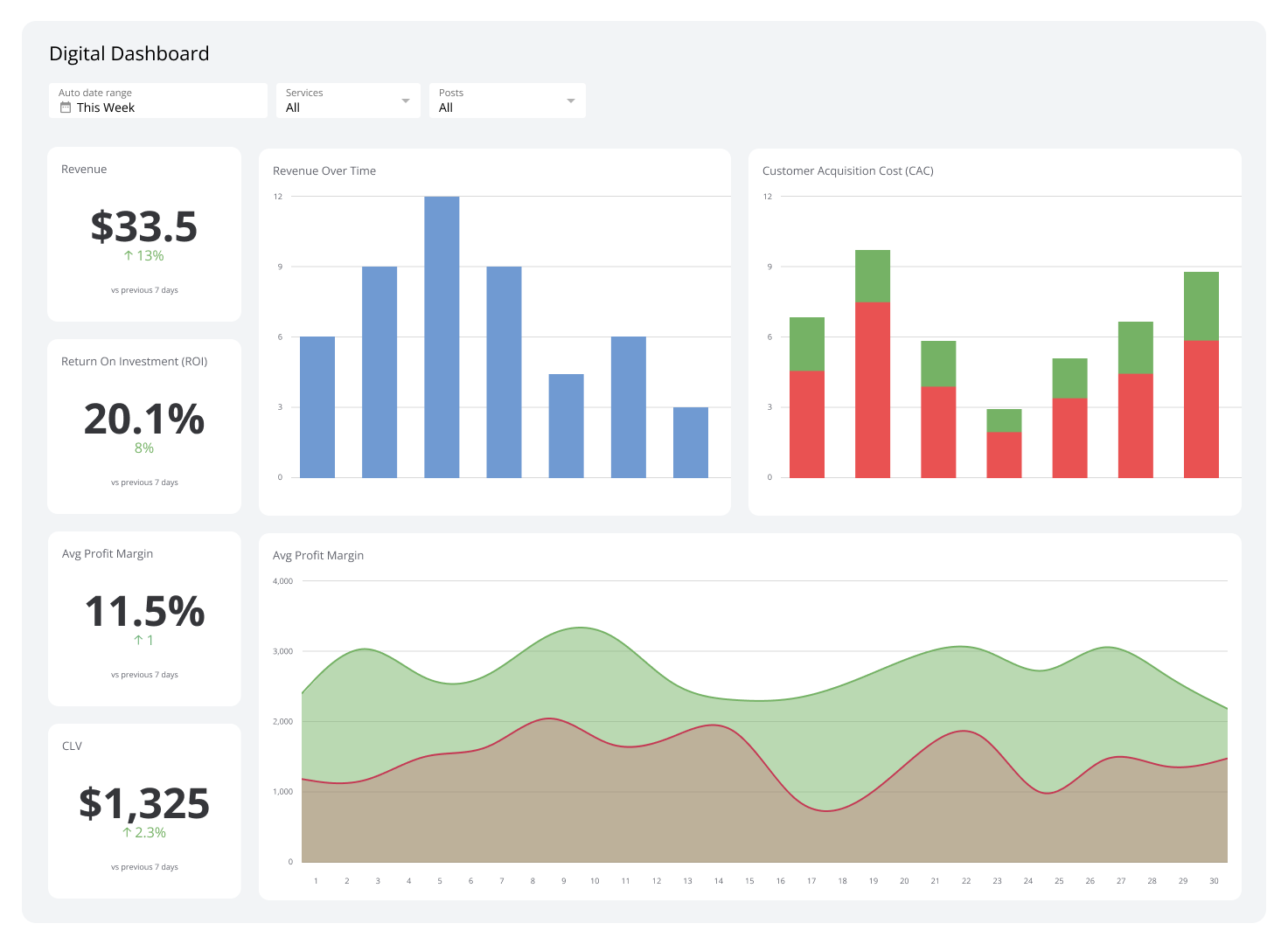
Executive dashboards aggregate and visualize data concerning multiple business aspects. They are designed for corporate leaders such as CEOs, CFOs, and COOs.
A typical executive dashboard highlights live productivity, revenue growth, and risk mitigation metrics. This real-time insight enables decision-making that will stop issues from occurring or escalating. Beyond that, it improves team collaboration by providing a 360° view of company performance.
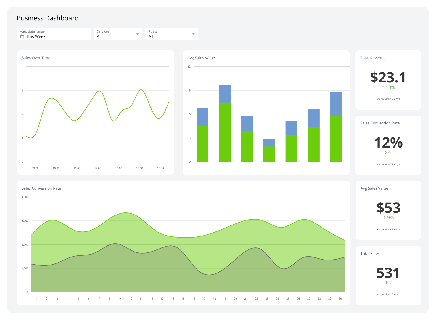
2. Sales dashboards
A sales dashboard provides a live overview of your company’s sales performance. It displays critical KPIs such as sales growth, allowing you to monitor progress in real-time.
Regularly monitoring a sales dashboard helps identify trends, such as seasonal sales patterns, and promptly address issues like declining sales.
By pointing out these trends, you can change inventory levels to satisfy demand increases. Moreover, overlooking declining sales enables you to improve your marketing or retrain your salespeople. This proactive approach optimizes your sales strategy, leading to a more resilient sales operation.
3. Marketing dashboards
Marketing dashboards picture metrics crucial to your marketing endeavors.
They display major reports to help you track your overall performance. Additionally, these dashboards give you the insights needed to fine-tune your marketing strategies for better results.
An average marketing dashboard displays website traffic, lead generation, conversion rates, and social media engagement. By using it, you can rest assured that your marketing efforts align with key business strategies and that you stay on target toward achieving your goals.
4. Development dashboards
A development dashboard is designed to help software developers monitor their projects. It outlines project status by illustrating metrics like code limits, bug reports, build stability, and feature completion rates.
This dashboard provides real-time insights, letting developers quickly pinpoint and resolve issues. For example, by monitoring code quality and building stability metrics, your development teams can maintain high standards and reduce downtime, which results in faster development cycles and more reliable software releases.
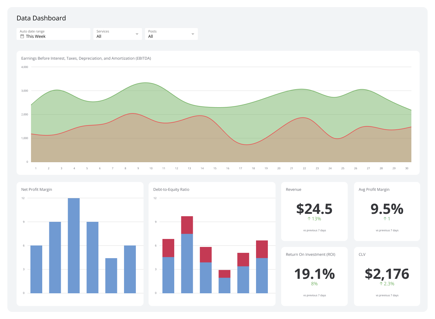
5. Financial dashboards
Financial dashboards offer an all-around view of a company's financial health.
They converge revenue, expenses, profits, and cash flow metrics. With them, you can quickly visualize KPIs to spot patterns that might go unnoticed.
These dashboards also streamline the collection and analysis of financial data, allowing you to react promptly to lucrative growth opportunities. Such opportunities often come in the form of online trends, customer behavior shifts, and seasonal market shifts, and when capitalized upon, they can lead to greatly increased profit.
6. Customer support dashboards
Monitor your business's customer support efforts with a customer support dashboard. This dashboard provides a clear view of critical metrics, such as response times, resolution rates, and customer satisfaction scores.
Regularly monitoring customer support dashboards can highlight customer support trends, helping you to allocate resources more effectively and train your team where it matters most.
By streamlining the analysis of metrics, these dashboards guarantee that your support remains aligned with your business goals. This alignment can reduce costs associated with prolonged issue resolution and improve your organization’s general customer retention scores.
Create your dashboards with Klipfolio
Dashboards assemble data from different sources in an understandable, real-time format. They provide invaluable insights, such as tracking financial performance or monitoring individual rep performance to aid businesses in pinpointing revenue drivers and areas for improvement.
Klipfolo’s dashboards make data acquisition straightforward. Start your free trial today and discover the power of raw data.