Website Analytics
Track and report on your website performance using web analytics and metrics.
Track all your Website Analytics KPIs in one place
Sign up for free and start making decisions for your business with confidence.

An analytics dashboard is a powerful tool for businesses to keep track of important data all in one place. These dashboards show key data and numbers in a way that’s easy to understand, allowing businesses to check on sales, customer interactions, or how well different parts of the business are doing.
By bringing together data from various sources, these dashboards provide valuable insights that help businesses make smart decisions quickly. Let’s talk about what an analytics dashboard is, its types, and the common mistakes that come with creating them.
What is an analytics dashboard?
An analytics dashboard allows you to visualize and interpret various key performance indicators (KPIs) and metrics relevant to your business or specific project. It consolidates data from multiple sources, displaying it in an easy-to-understand and interactive format. This way, you can quickly glean insights that help drive informed decisions.
When you use an analytics dashboard, you have the ability to track everything from sales figures, customer engagement, operational efficiency, to much more. It’s an essential component for businesses that need to monitor and optimize their overall performance or a specific aspect.
How different is an analytics dashboard from a data dashboard?
While a generic dashboard might simply display data or information, an analytics dashboard is designed with the intent to enable deeper analysis and facilitate decision-making.
For example, an analytics dashboard might include tools for slicing data, drilling down into datasets, or even integrating predictive analytics.
Analytics dashboards are often part of complex data systems that integrate data from multiple sources. They can handle large volumes of data from various sources—like sales databases, customer relationship management systems, and web analytics tools—to provide a comprehensive view of the business landscape.
7 types of analytics dashboards
Each dashboard caters to the unique users’ needs and supports decision-making in their respective domains. From sales performance and marketing analytics to financial health and HR operations, these examples showcase how effective dashboards can simplify complex data sets and drive performance management.
1. Sales performance dashboard
A sales performance dashboard provides a comprehensive overview of all sales activities within a company. It tracks metrics such as bookings, sales opportunities, revenue tracking, and sales team performance.
This type of dashboard helps sales managers monitor targets, forecast future trends, and identify areas requiring improvement. Here's a breakdown of the key metrics that should be part of your sales performance dashboard:
- Sales Bookings: Track the total number of sales or contracts signed within a specific period.
- Product Performance: Analyze which products are performing best in terms of sales volume and revenue.
- Sales Opportunities: Monitor the potential sales or leads that could convert into revenue.
- Revenue Tracking: Compare your actual revenue against your sales goals to assess how well your team is performing against targets.
- Average Deal Size: Understand the value your sales team is bringing in per customer, and forecast future revenue.
- Sales Cycle Length: Track the average time it takes to close a deal from the initial contact.
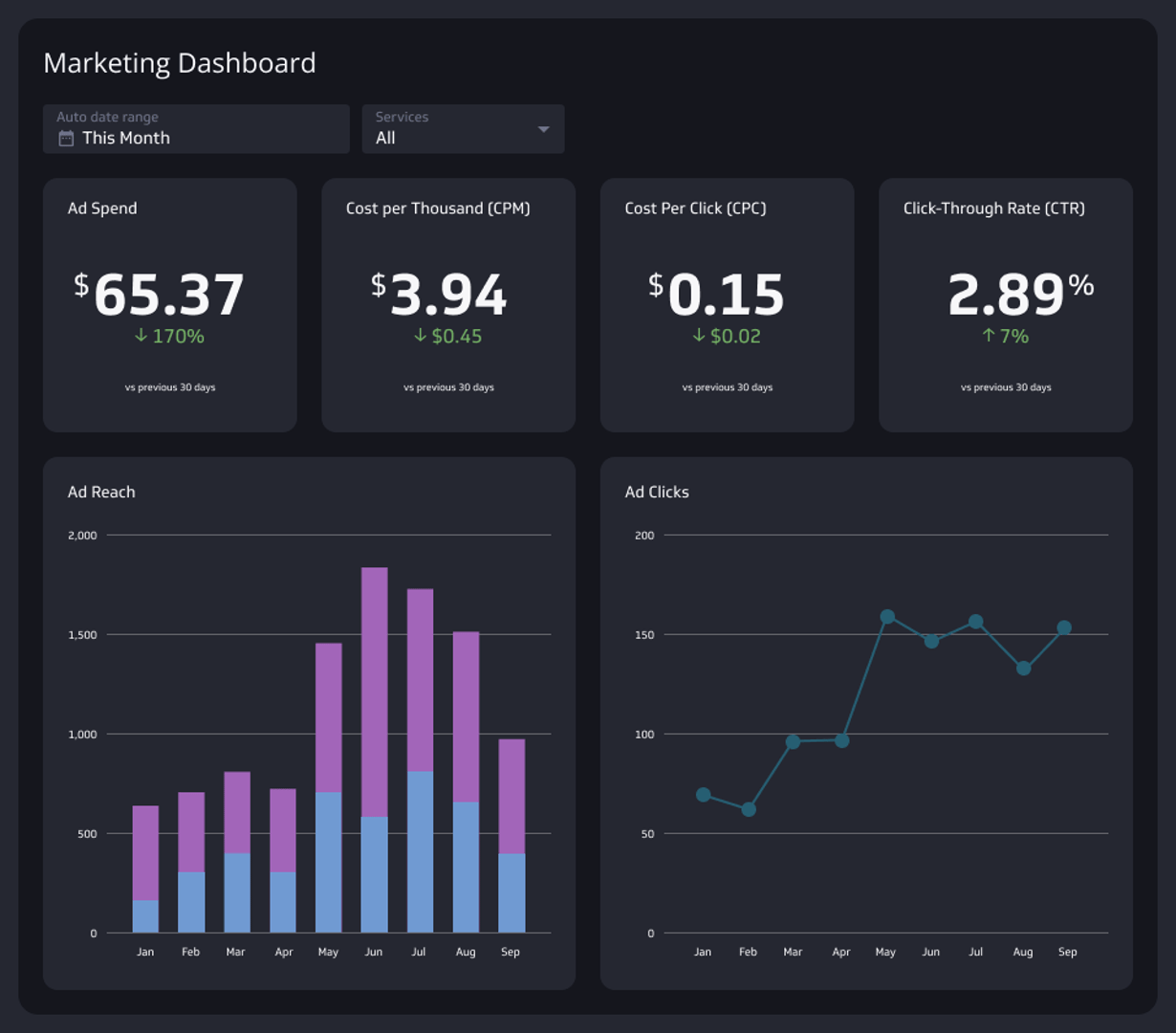
2. Marketing analytics dashboard
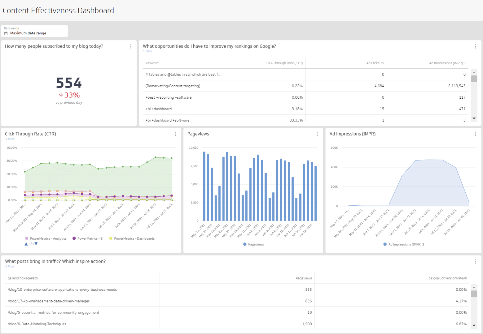
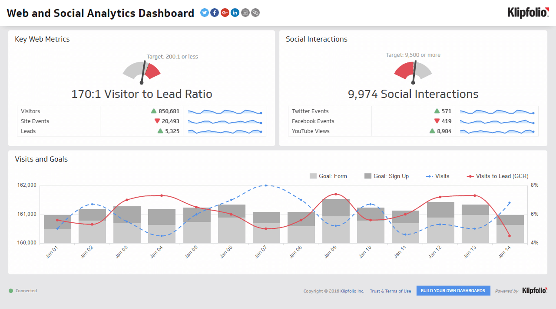
A marketing performance dashboard tracks the effectiveness of your marketing campaigns across different channels. It often features tools for analyzing consumer behavior and campaign performance so you can adjust strategies in real time to achieve the best outcomes.
- Purchase Funnel Metrics: Track the customer journey from awareness to decision.
- Traffic Sources: Identify where your visitors are coming from—be it organic search, paid ads, social media, or referrals.
- Goal Completion Rate: Measure how often visitors complete targeted actions, such as filling out a form, signing up for a newsletter, or making a purchase.
- Return on Marketing Investment (ROMI): Calculate the revenue generated from marketing campaigns relative to the cost of those campaigns.
- Engagement Metrics: Track how engaged users are with your content through page views, time on site, and social media interactions.
- Lead to Close Ratio: Analyze how many leads are converting into sales.
3. Financial dashboard
A financial performance dashboard provides critical insights into a company’s financial status for informed decisions regarding investments and cost management. These are the metrics to have in a financial dashboard:
- Current Ratio: This is a liquidity ratio that measures your company's ability to pay off its short-term liabilities with its short-term assets. A higher current ratio indicates a stronger liquidity position, which is vital for day-to-day operations.
- Working Capital: This metric calculates the difference between current assets and current liabilities. Positive working capital suggests that the company can fund its current operations and invest in future activities, which is a good indicator of financial health.
- Debt-to-Equity Ratio: This ratio compares the total liabilities of a company to its shareholder equity. It is a measure of the degree to which a company is financing its operations through debt versus wholly-owned funds.
- Gross Profit Margin: This indicates the percentage of revenue that exceeds the cost of goods sold. It helps assess the efficiency of your production processes and pricing strategies.
- Operating Cash Flow: Tracks the cash generated from operations, providing insight into the liquidity available for business expansion, reducing debt, or returning money to shareholders.
4. HR analytics dashboard
An HR dashboard tracks a company’s workforce and human resources operations. The metrics it should display include:
- Applications Received per Vacancy: Tracks the number of applications received for each job posting.
- Cost per Hire: Measures the total cost involved in hiring a new employee, including advertising, recruiting staff time, and other administrative expenses.
- Job Offer Acceptance Rate: Calculates the percentage of job offers that are accepted by candidates.
- Open Job Requisitions: Tracks the number of job positions that are currently open and need to be filled.
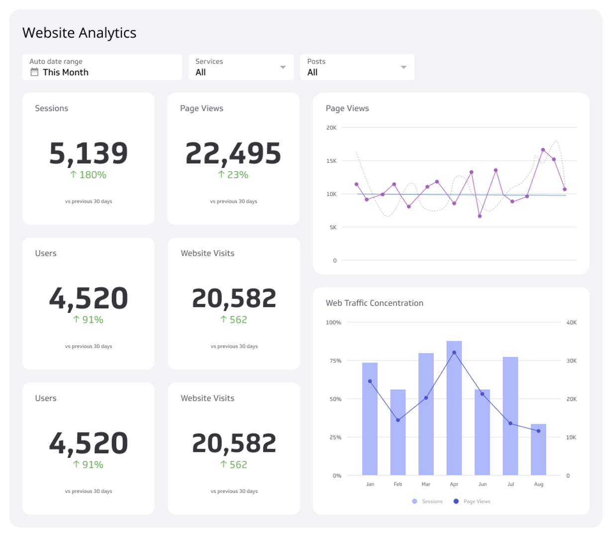
5. Web analytics dashboard
A web analytics dashboard provides insights into user interactions and the effectiveness of content. It’s useful for all businesses to monitor these metrics:
- Web Users: Track the total number of unique visitors to your website to gauge its reach and how effectively it attracts new traffic.
- Sessions: Monitor the number of sessions on your website to understand user engagement levels.
- Bounce Rate: This metric shows the percentage of visitors who leave your site after viewing only one page.
- Traffic by Source: Analyze where your traffic is coming from, whether it's search engines, social media, direct visits, or referral links.
- Traffic by Device: Understand what devices your visitors are using, such as mobiles, tablets, or desktops.
6. Project management dashboard
Project managers must track project timelines, budgets, resource allocation, and progress against milestones. A project management dashboard is key for keeping project teams on track by displaying:
- Completed Tasks: Track the number of tasks completed within a certain period.
- Project Updates: Monitor real-time updates on project activities.
- Time on Project: Compare the actual hours spent on the project against the planned hours.
- Budget Utilization: Track the amount of budget spent versus the total budget allocated for the project.
7. Customer support dashboard
The customer support dashboard will help you track customer satisfaction, response times, and issue resolution rates. Some important metrics to include in a customer support dashboard are:
- Ticket Volume: Track the total number of support tickets created over specific periods (daily, weekly, monthly).
- Response Times: Measure the average time it takes for your support team to respond to a customer ticket.
- Resolution Rates: Monitor the percentage of tickets resolved on the first interaction compared to those that require follow-ups or escalation.
- Customer Satisfaction Scores (CSAT): Collect and analyze feedback from customers regarding their satisfaction with the support they receive.
How to make an effective analytics dashboard
Creating an effective analytics dashboard involves more than just displaying data. It requires careful planning, understanding your audience, and choosing the right metrics and tools to deliver valuable insights.
Here’s how you can develop an effective analytics dashboard:
1. Outline your objectives
Before you start designing your analytics dashboard, define what you want to achieve with it. Understand the specific needs of the users who will interact with the dashboard.
Are you aiming to improve performance, monitor user behavior, or measure progress against strategic goals? Your objectives will guide the design and functionality of your dashboard so that it delivers the right information in the most effective way.
2. Select the right metrics
The metrics you choose should directly reflect the objectives you've set. Include KPIs that help track progress towards these goals.
As shown above, for a web analytics dashboard, this might mean focusing on metrics like bounce rate and traffic sources. Each metric should provide insight and drive actions based on the dashboard’s intended use.
3. Consider data sources and integration
Effective dashboards rely on high-quality data. Identify where your data will come from and make sure that it can be reliably integrated into your dashboard.
This might involve data integration from CRM systems, financial software, marketing platforms, or external databases. The ability to synchronize and update data in real-time or at scheduled intervals will help you maintain the accuracy and relevance of the information displayed.
4. Design for clarity and usability
Your dashboard should be designed with user experience in mind. Arrange information logically and group related data together.
Remember to use visual elements like charts, graphs, and tables to make complex data easier to digest. Colors, fonts, and layout should be consistent and aid how you interpret data without distracting from it.
5. Make it interactive
Interactivity enhances the usability of an analytics dashboard. It allows users to drill down into the data, filter views, or adjust variables to explore different scenarios. This feature can be particularly useful in complex dashboards, such as those used for financial analysis or detailed performance tracking.
6. Test and iterate
Once your dashboard is in use, gather feedback from its users and monitor how effectively it’s meeting their needs. Are they able to find the information they need? Do the visualizations serve their intended purpose? Use this feedback to refine and improve the dashboard.
7. Focus on scalability and security
As your organization grows, the scope of your dashboard will, too. Plan for scalability from the start so that your dashboard can handle increased data loads and a growing number of users without performance issues.
Additionally, you should put up appropriate security measures to protect sensitive information and control data access.
Common mistakes when creating analytics KPI dashboards
Creating an analytics dashboard requires having a clear strategy and attention to detail. Avoiding these common mistakes can make your dashboard more effective.
Here are some frequent mistakes to watch out for:
1. Overloading the dashboard with metrics
One common mistake is trying to include too many metrics on one dashboard. When dashboards are filled to the brim with information, it can be overwhelming and confusing for users. This defeats the purpose of a dashboard, which is to provide a clear and concise overview of your key data.
We recommend focusing on including only the most relevant metrics that align with your strategic goals.
2. Lacking clear objectives
Another mistake is not having clear objectives. Without a defined purpose, your analytics dashboard can become a random collection of data points that don’t provide actionable insights.
Before you begin designing your dashboard, figure out what decisions the dashboard needs to support and which users it is intended for. This can guide your design and make sure the dashboard serves a useful function.
3. Neglecting data accuracy and quality
Using inaccurate or low-quality data can lead to misguided decisions that could harm your business performance. Keep your data reliable, up-to-date, and thoroughly validated. Investing time in data cleansing and validation processes is key to maintaining the integrity of your insights.
4. Failing to design for the audience
The dashboard should be designed with the end-user in mind. Different users might need different dashboards tailored to their specific roles and needs.
A common oversight is creating a dashboard that is either too technical for non-technical users or too simplistic for advanced users. Understand your audience and customize the dashboard to be as effective as possible for its intended users.
PowerMetrics’ no-code interface empowers users across all levels of technical proficiency. This way, even non-technical users can easily navigate the dashboard, define their metrics, and access the data they need without overwhelming complexity.
Nonetheless, advanced users can still delve deeper into data analytics with robust tools and customizable options, making the dashboard scalable to more complex requirements.
Boosting business with analytics dashboards
Analytics dashboards make it easier to see important business data, turning complex information into clear insights for better decision-making. Make presenting data easier and grow your business with Klipfolio PowerMetrics.
With a good dashboard set up, you can see your current wins and plan your future. Get started free today!


