What's New: Fall 2021 PowerMetrics updates

Published 2023-06-22
Summary - A round-up of what's new in PowerMetrics, including colours, PDF printing, and instant metrics for popular data services like Salesforce and GA4.
“What’s new?”—a casual question often answered with, “Not much, you?”
If you were to ask anyone at Klipfolio what’s new, I can almost guarantee the answer wouldn’t be the familiar rhetorical reply, but instead an enthusiastic “How much time do you have?”
Our product team has been busy behind the scenes bringing some of PowerMetrics best features to our users. This is a quick round-up of what’s new in PowerMetrics for Fall 2021.
Colours are here!
Remember the famous line from mid-2000s reality TV show Jersey Shore: “Cabs are here!”? I can’t help but announce colours in the same way. Imagine us yelling from the doorway, colours are here!
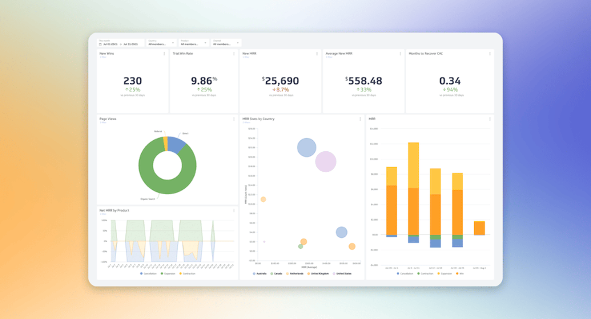
You can now control colours for charts on metric dashboards. This customization enables you to create a cohesive and visually appealing dashboard by choosing from our colour assignment options or applying your own custom colours.
The world is your rainbow—use your brand colour palette, your favourite colours, or take the monochrome approach. Any way you slice it, colours are here!
Check out this quick tutorial on applying colours to your metrics.
Download and print your dashboards as PDFs
We’ve heard your requests and we made it happen. If you have a plus, pro, or custom plan, you can now download and print your dashboards. (If you have a free plan, you can still access browser-based printing!)
Some helpful tips when preparing to download and print your PowerMetrics dashboard:
- Make sure your dashboard is in view-mode, not edit-mode
- Check the PDF preview before you print to make sure your dashboard is displayed properly. You might have to adjust your metric widgets on your dashboard to ensure the page breaks in an optimal place.
Individual metric printing is on the horizon—stay tuned! If you want to print an individual metric today, you can use the browser-based printing feature.
Instant metrics for Salesforce, Zendesk, and Google Analytics 4
New instant metrics for popular services like Salesforce, Zendesk, and Google Analytics 4 are now available in PowerMetrics so you can start tracking your most important customer data—instantly.
Pick from over 25 Google Analytics 4 instant metrics, like ad clicks, page views, or sessions, and popular Salesforce metrics and build out the ultimate customer-behaviour focused dashboard.
Duration is now available as a format type
Duration is now available as a format type for columns in the data modeller and to select as a value for custom metrics. Duration is in addition to the existing format types: text, number, percentage, currency, and date.
Auto date range
The list of pre-set date range filters now has a new option: auto date range. If you choose the auto date range filter, it will display data for today minus the number of days included in your plan. For instance, if you have a free-forever plan, your auto date range will display your day for today minus 62 days—the maximum number of days for a free plan.
Two notable advantages with the auto date range features:
- It’s an excellent feature to use if you want to compare metrics on a dashboard
- You will see as much historical data as your plan allows while still keeping the date range and x-axis in alignment
Try these new features in PowerMetrics today
If you’ve read this far and don’t have a PowerMetrics account, you can still sign-up! It’s free forever and with new features coming every month, there’s always a new and improved way to track the metrics that matter to you and your business.
Stay tuned for a roundup of our Winter 2022 (wow, 2022 is just around the corner!) features and releases so you can continue to build and share dashboards that support better, faster business decision-making.
Related Articles

Case Study: How Media Propulsion Laboratory improved client analytics with the PowerMetrics – BigQuery integration
By Cathrin Schneider — September 12th, 2024
Metrics provide rich context for better AI: Introducing the new PowerMetrics AI experience
By David Mennie — June 21st, 2024
PowerMetrics - New data warehouse integrations and Cube semantic layer support
By David Mennie — June 14th, 2024

