YouTube Analytics Dashboard
Bring your YouTube performance analytics into PowerMetrics so you can understand your audience and engagement insights—all in one place.
What is a YouTube Analytics Dashboard?
A YouTube dashboard is a visual representation of the metrics and KPIs that give you insight into your overall engagement and performance on YouTube. You can use the data on your YouTube dashboard to develop your video strategies or identify areas for growth.
When you monitor your YouTube data on a dashboard, you can answer important questions like:
- Which videos generate the most views?
- Are my videos engaging and retaining viewers?
- Where are people discovering my videos?
- How many subscribers do I have?
A YouTube dashboard will provide you with actionable insight on video performance.
What metrics should be included on a YouTube dashboard?
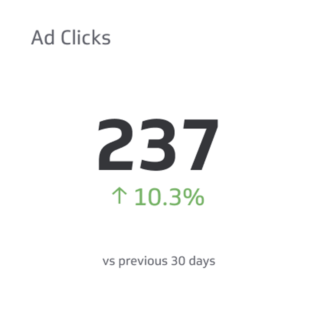
Ad Clicks
Counts the number of times users have clicked on a digital advertisement to reach an online property.
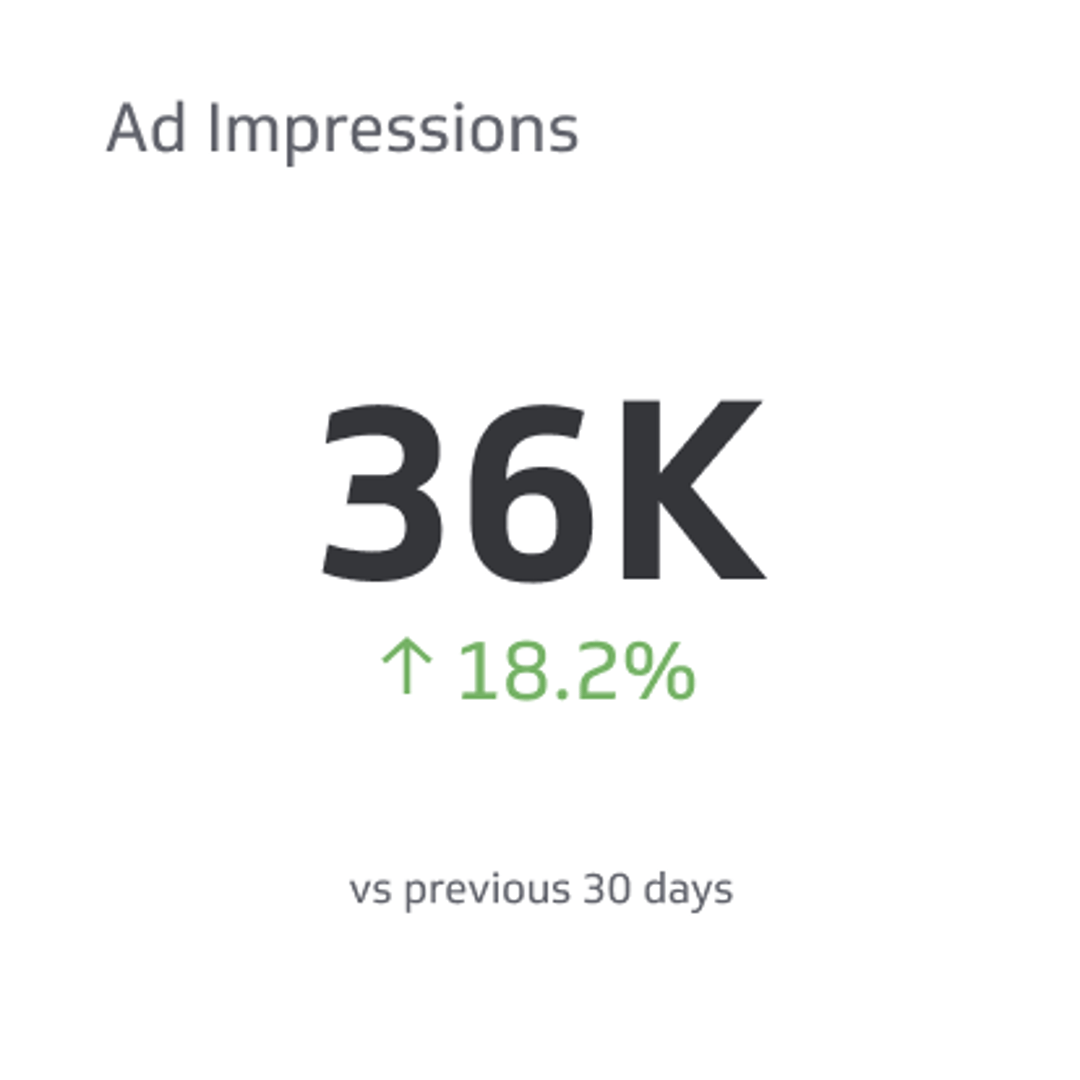
Ad Impressions
Ad impressions are a count of the total number of times digital advertisements display on someone’s screen within the publisher's network.
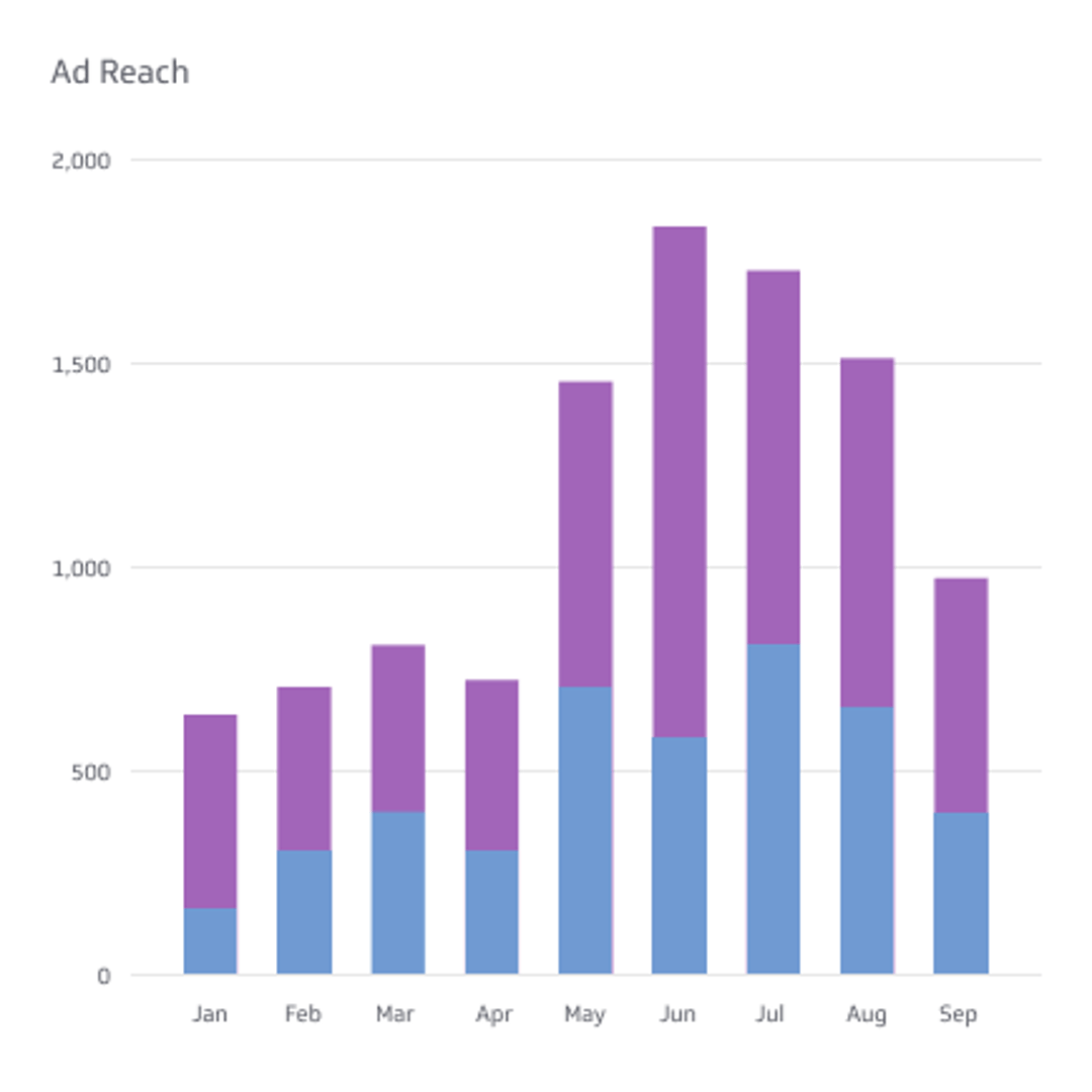
Ad Reach
Ad Reach is a count of the number of people who viewed your ads at least once.
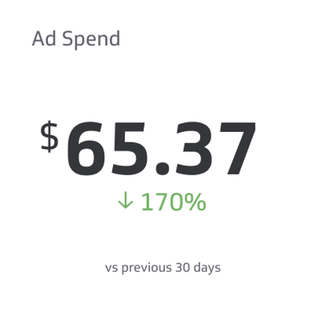
Ad Spend
Ad Spend is the amount of money spent on specific ad variations within a specific campaign or ad set.
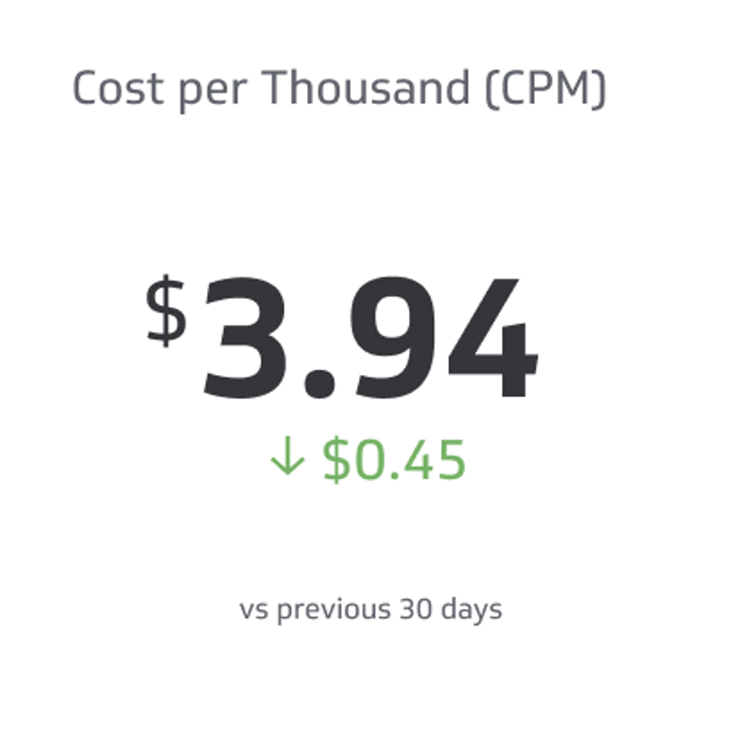
Cost per Thousand (CPM)
Cost per Thousand (CPM) is the price of 1,000 advertisement impressions on an advertiser's webpage.
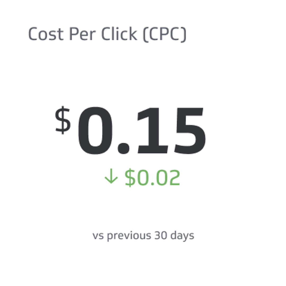
Cost per Click (CPC)
Cost per click is the price an advertiser pays a publisher for each click on a link.
What type of visualization works best on a YouTube Analytics dashboard?
YouTube analytics are collected over time and contain dimensionality. You can break down your video views by traffic source, location, or device type to understand where and how people are consuming your videos. And because it’s collected over time, you can compare your data over time periods in order to understand your performance and what might impact how a video performs versus under-performs.
This is where the familiar data visualizations fall into play—bar charts, line charts, and scatter plots. Temporal data visualizations have an x- and y-axis and make it simple to compare values over a period of time. Do you want to slice and dice your data to see more information about values in a particular dimension? This is an opportunity to use a pie or donut chart, a venn diagram, or a histogram.
With that in mind, let’s take a look at the data visualization types you can consider for a YouTube dashboard.
Use a bar or a line chart
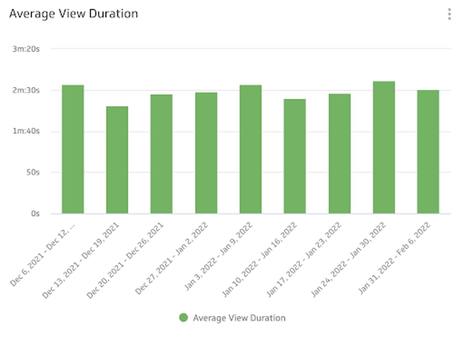
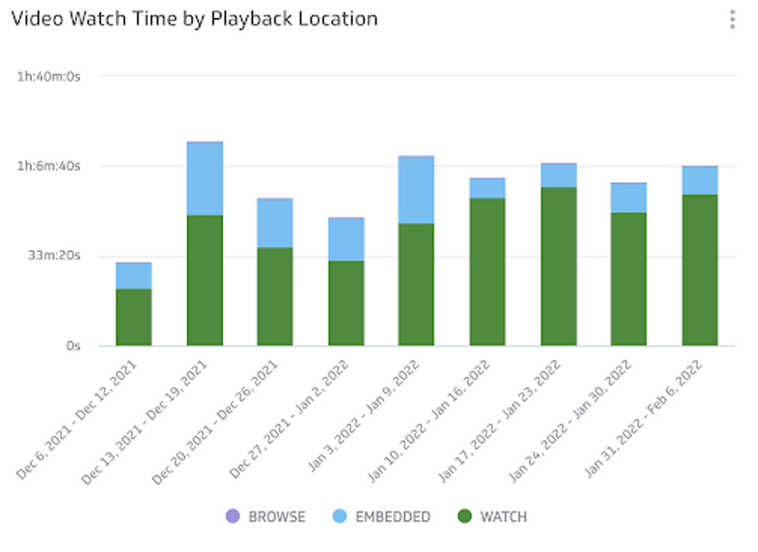
For example, if you want to compare video watch time by device each week, you can use a bar chart. Visualizing average view duration gives you a quick and easy way to see the average amount of time people spend watching your videos week over week.
Use a pie chart to compare values
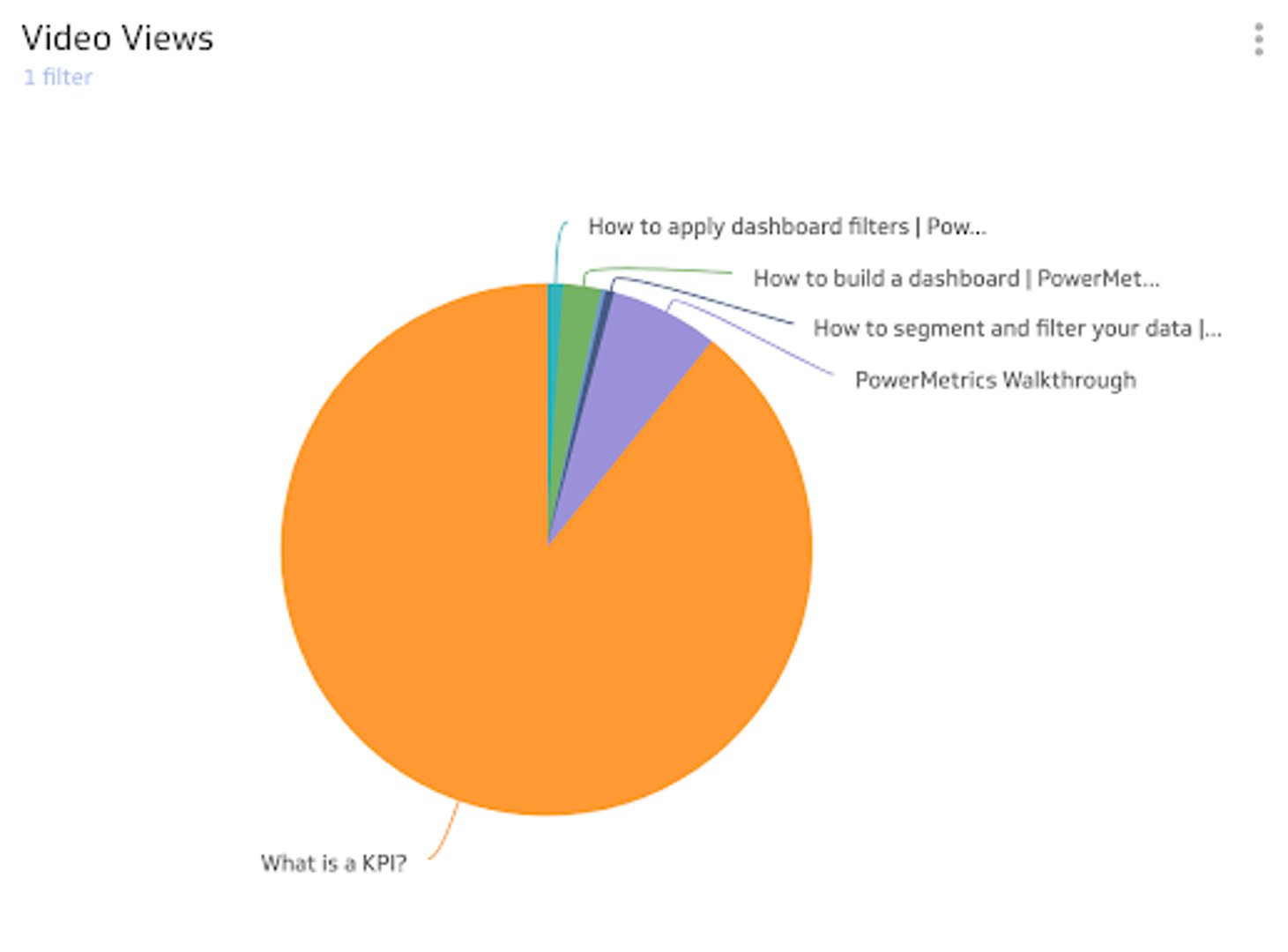
While a pie or donut chart isn’t a great way to compare performance or identify any trends, this is a simplified way to see parts-of-a-whole or compare values. For example, add video views to your dashboard and use a pie chart to see how videos compare against each other over a specific time period.
Use a summary chart for quick analysis
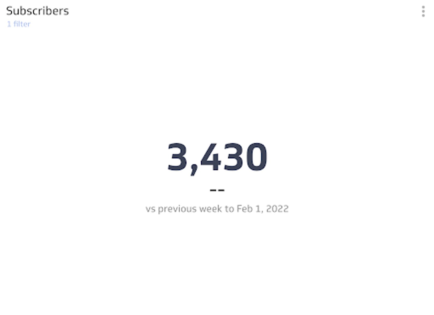
Want to track your subscriber growth in a quick and easy format? Use a summary chart and add a comparison value (a percentage or number is available in PowerMetrics) so you can see if you’re trending up or down.
Benefits of a YouTube analytics dashboard
The core benefit of a YouTube analytics dashboard is that everyone on your team can check-in on your YouTube video performance. Although you may be an expert in your domain, not everyone viewing your dashboard will be. Creating a YouTube dashboard that you can share across your team or organization makes it easy for everyone to understand how your video marketing is going.
Dashboard inspiration for your YouTube analytics
It can be hard to know where to start. How do you organize your YouTube metrics in a way that makes sense for you, as the subject matter expert, and others who may be referencing your dashboard? Here are a few ways you can design your dashboard to focus on specific areas of performance/
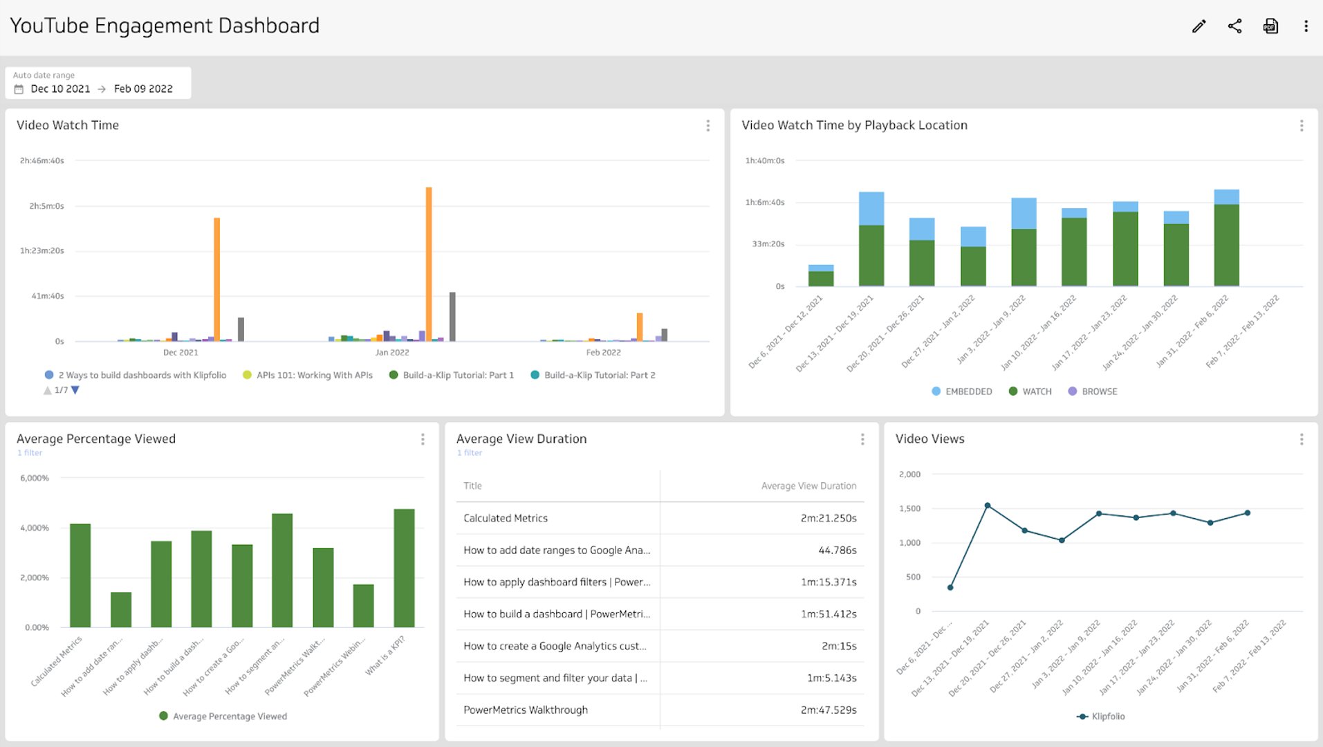
Track viewer engagement with your YouTube videos
Build a dashboard that focuses on how people are engaging with your videos. Use this dashboard to answer questions like:
- What is the average view duration of my videos?
- What is the average percentage viewed on my videos?
- Is my audience dropping off after a certain length of time?
Looking at your metrics will not only help to answer these questions, but it can help you narrow your focus so you can create the video content that keeps your audience engaged and continually coming back for more.
Track your growth on YouTube
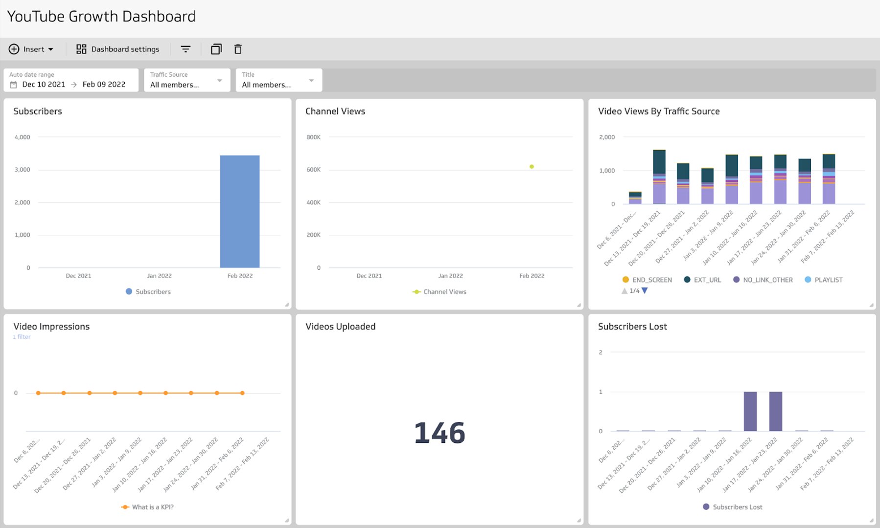
Are you looking to focus on areas of growth for your YouTube channel? Build a growth dashboard with the metrics that tell the story of your channel growth. This will help to inform your video marketing strategy moving forward and answer questions like:
- How many subscribers do I have?
- What are my channel views?
- What geographical areas or traffic source performs well?
This will help you narrow your focus and align your future growth efforts.
How to build a YouTube analytics dashboard
This dashboard can be created in PowerMetrics. Start your free account here and follow along!
Create instant metrics
- After you log in to your account, navigate to Metrics in the left side-nav
- Click Add Metrics in the top right corner
- Search or scroll for your data service to find instant and custom metrics
- Select YouTube
- Connect and authenticate your account
- Select the metrics you want to add to your dashboard and click Add Metrics
Explore each metric and pick the best data visualization
- Click on the metric
- Use the Display tab to explore different visualizations
- Use the Data tab to apply segmentations
- Use the filter option to exclude or include specific data points
Add your metrics to a dashboard
- In the metric explore view, click the 3-dot menu in the upper right corner
- Select Add to Dashboard to create a new dashboard to add to an existing dashboard
- Drag and drop and resize the metrics on your dashboard in a way that works for you
What does success look like with a YouTube dashboard?
A YouTube analytics dashboard is a reporting tool that provides your entire team with the metrics and insights needed to understand your video marketing performance. Everyone, regardless of department or subject matter expertise, should be able to understand the data being presented—that’s a signal of a well-designed and thorough dashboard.
YouTube analytics dashboards are a window into what’s working or what’s not. The data on your dashboard is the key to what you can do to optimize your video marketing performance or identify trends in engagement and behaviour from your viewers.
Related Dashboards
View all dashboards

