Release Roundup - 4 new data visualizations for your dashboard

Published 2023-03-21
Summary - Tired of the same old visualizations? Check out these 4 new data visualizations to add to your dashboard and a new data connector you don't want to miss! Learn more in this update release.
The next time you sign in to app.klipfolio.com, you will be greeted by a host of new features, not least of which is the new and improved charts. If you check out the changelog, you will notice that we've kept up an intense release schedule since Klipfolio Dashboard went live last year, with 10 major releases this year (so far). If you're wondering how we're able to do it, the answer is we drink really good coffee.
Top 5 features
All kidding aside, let's take a closer look at the top 5 features added in this release of Klipfolio Dashboard.
1. Charts (Invert / Tooltips)
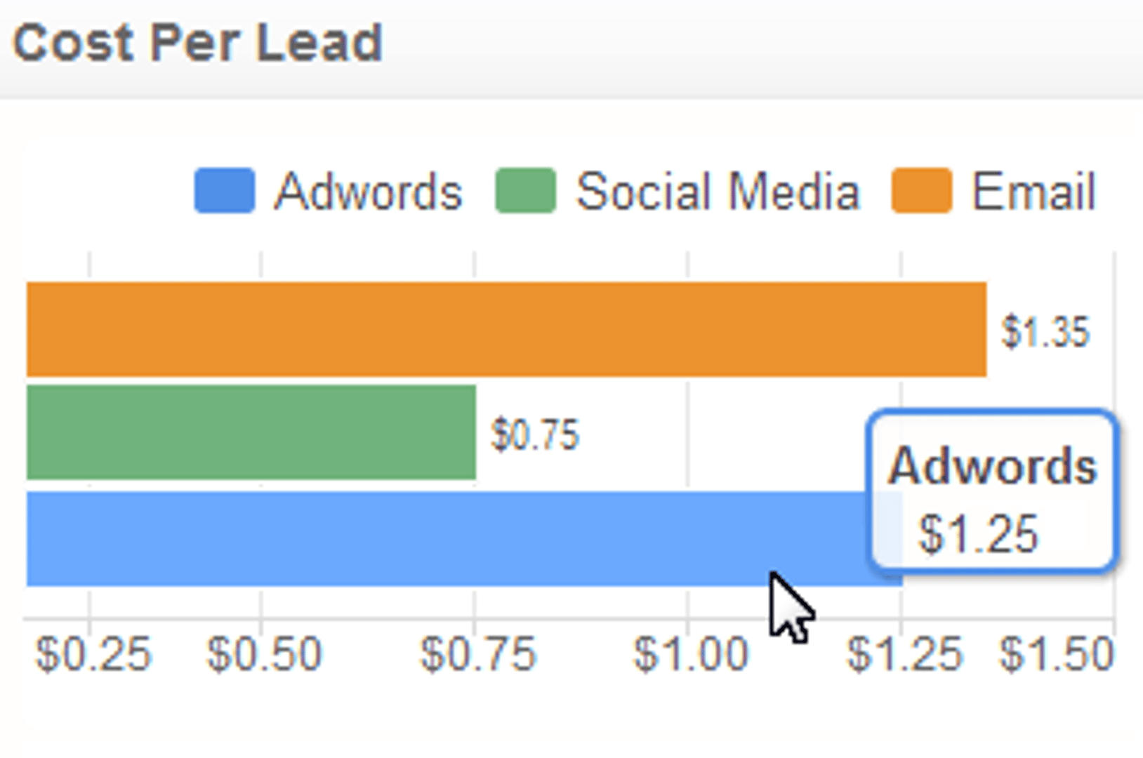
This image shows a few important changes to the Bar/Line chart component. First, you can now invert the axis on charts, which is nice if you're displaying a single value on each series (such as cost per lead). Second, charts now support tooltips so you can quickly see details about the values shown on the chart. Third, we've added a host of new options for your axis labels, such as custom range intervals and the ability to hide axis.
2. Charts (Drawing Lines)
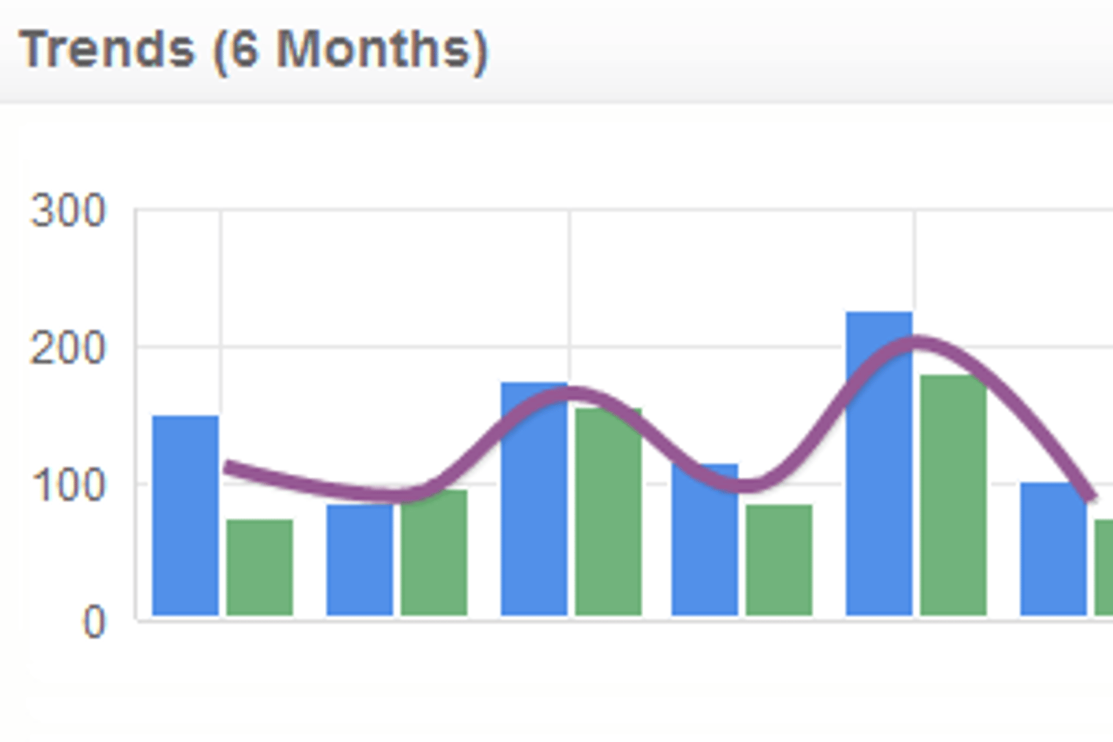
If you're looking to add a line to your chart, you now have lots of options to run with. This image shows off a "smooth" line that is used to show an average of two series. But you can use dashes, dots, increase / decrease the thickness of the line, override the default colour of the line, as well as add area shading to the line. Check out the Properties panel for each component to see what else is new with charts.
3. Dessert Charts (Pies and Donuts)
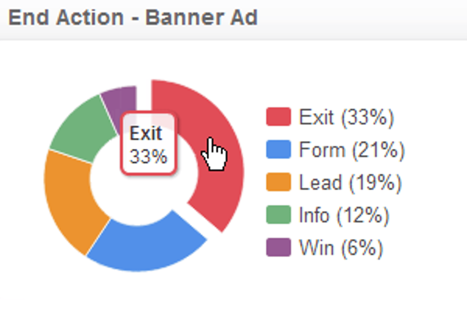
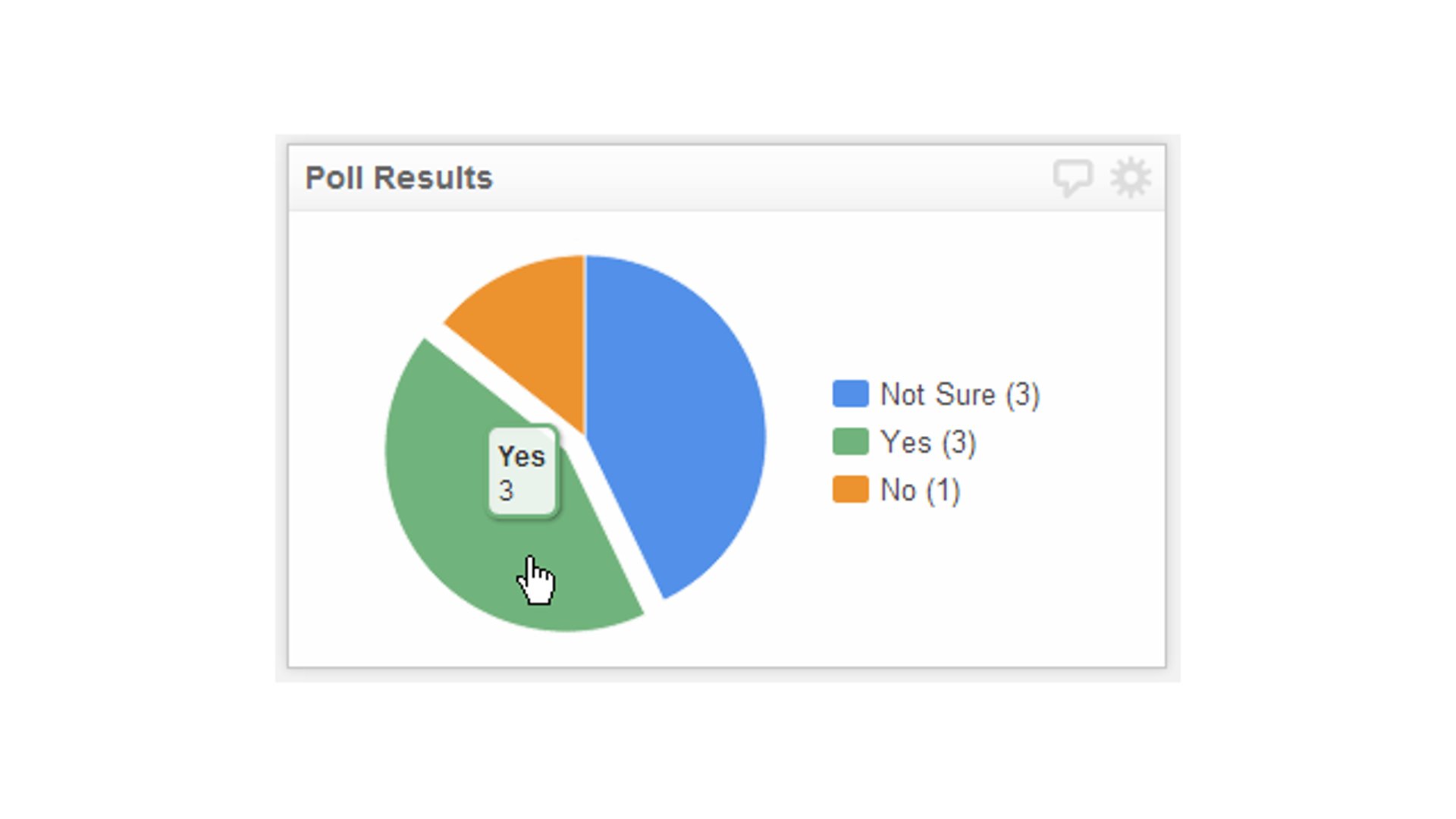
Along with the significant updates to the Bar/Line chart component, Pie charts have also received a tasty update, including the ability to create donut charts. As well as adding tooltips to pie charts, now if you click on a "slice" of the pie, it will separate away from the rest of chart for easy consumption. Am I succeeding at making you want to go to the nearest coffee shop yet?
4. New component: Scatter Plots
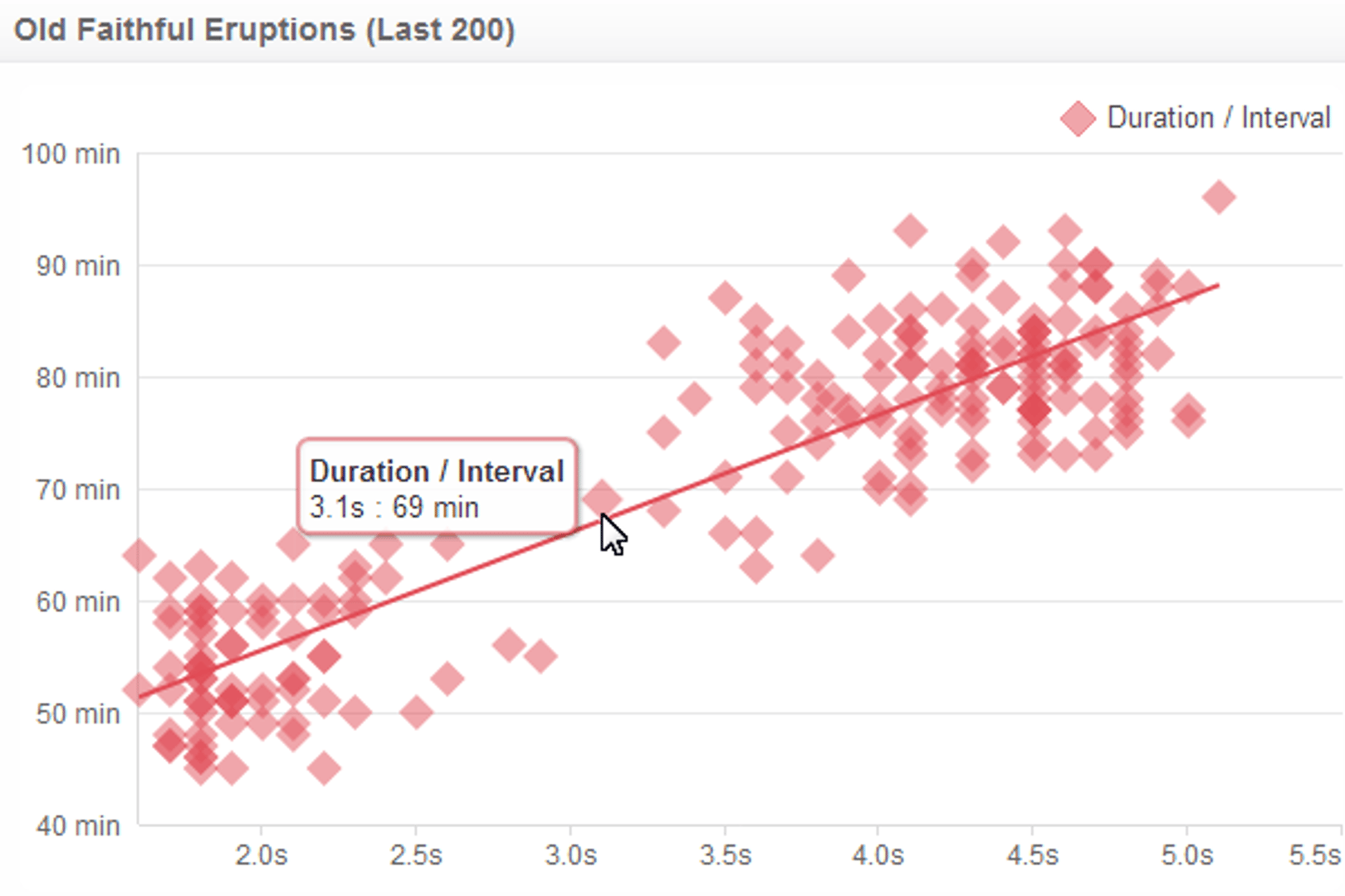
When I think of Scatter Plots, I always seem to think of the classic example of plotting the duration and interval of Old Faithful's eruptions. This new component allows you to plot a regression line for each series of data. I think you'll "burst" with joy the first time you sign in to app.klipfolio.com and start playing with the Scatter Plot component (I couldn't resist the pun).
Note: To see the full size image, check out this Facebook preview.
5. UserVoice data support
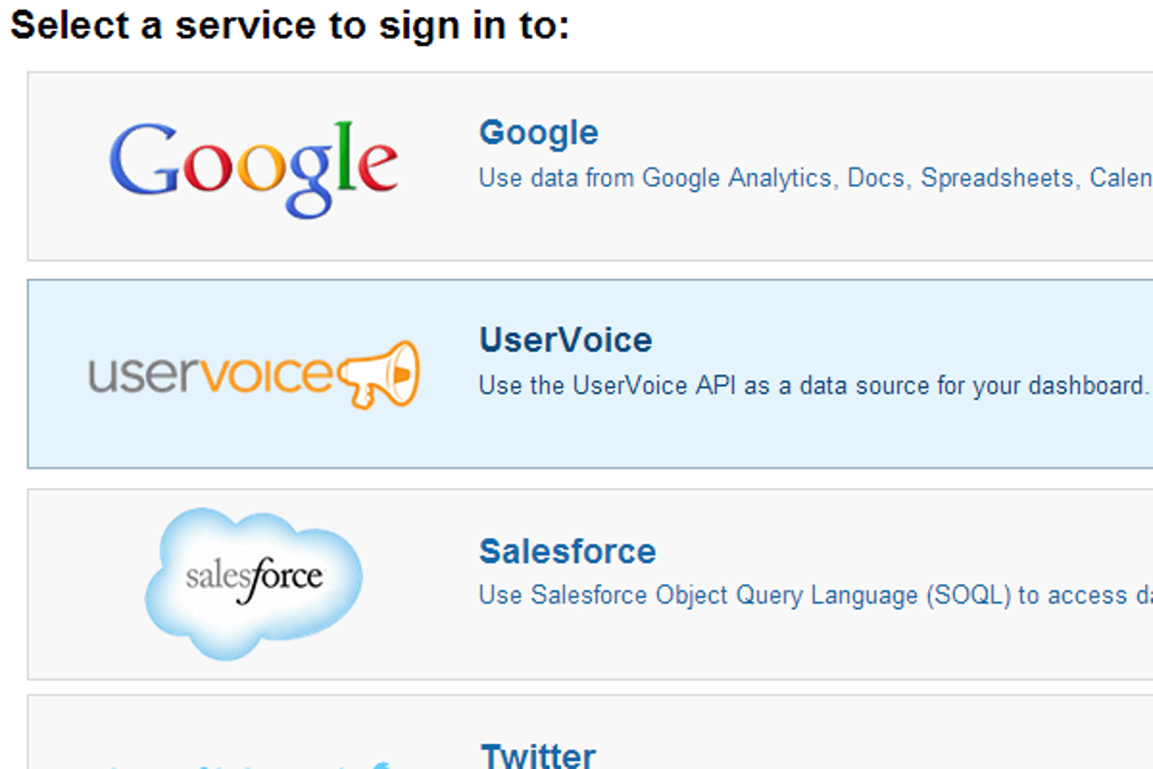
You might say it all started with a tweet, but in reality the addition of UserVoice data source support was already in the works. The amount of data you can pull from UserVoice's API and plug into Klipfolio Dashboard is pretty awesome. I suggest you head over to our documentation and check out some of the sample queries to see what I mean.
Extra: The aforementioned tweet led to Klipfolio being contacted to lend a quote to a recent article in Wired that looks at the gamification of customer support.
Related Articles

Klipfolio Partner How-To #1: Duplicating dashboards across client accounts
By Stef Reid — November 27th, 2025
The Starter Guide to Dashboard Design
By Emily Hayward — September 24th, 2025
What is a data dashboard?
By Emily Hayward — August 18th, 2025