Key metrics for agile development teams
Published 2023-02-01
Summary - The Klipfolio engineering team uses a dashboard to monitor key metrics that help deliver development commitments and stay on track with our goals.
Our CEO, Allan Wille, mentioned in a recent blog, that it is very important to select a set of KPIs and monitor them to ensure the success of the business. It goes without saying that a data-driven business has to incorporate monitoring in all parts of the organization from operations to development and not just at a high level..
The Klipfolio engineering team, like other areas of the business, uses the Klipfolio dashboard to monitor key metrics that help us deliver on development commitments. Learn how Klipfolio turns your data into insight. At a high-level, we have the following four main objectives that contribute to our bottom line:
- Continuously deliver features and updates to production through our pipeline
- Tackle issues/defects reported by customers ASAP
- Keep a balance between maintenance and feature work
- Ensure long term roadmap projects are on track
None of the aforementioned goals should be a surprise to a development manager as most software development organizations share these aims. If you are a development manager in either a large engineering shop or a small start up you can take advantage of keeping the above goals in mind and monitoring the metrics that helps you achieve these goals.
The metrics and visualizations that we monitor on our data dashboard help us stay on track with respect to the above goals. Klipfolio’s app allows us to create metrics and visualizations from various data sources so we can look at all the important information we need on just one dashboard that is focused on our goals as opposed to switching back and forth between several different tools. The screen capture below is the agile dashboard that we use. We also have a few other dashboards that we use for monitoring our production environment and operations but that will be the topic for another blog post.
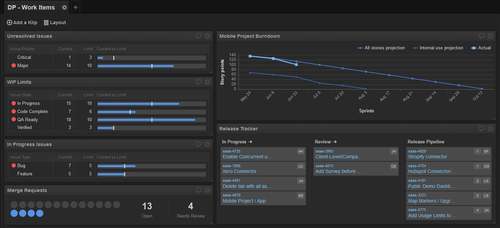
See the live dashboard here.
We project this dashboard live on our big screen TV, which is visible to everyone on the team. We also use the dashboard in our daily standup meeting to highlight any action that needs to be taken. As an example, when too many items are ready to be released, we focus on releasing those for the day instead of picking up new items.
In the rest of this post we’ll go through the metrics and visualizations one-by-one and explain how we use them in our team, what actions we take based on monitoring the metrics, and what data sources we use. This approach could be used in any agile dev team. Feel free to use our dashboard as a model, if you find it useful.
Unresolved Issues

Description
This visualization, which is a bullet chart with conditional indicators, is used to track the number of Critical and Major issues. The priority of these issues are identified in our bug triage meeting where we review the incoming defects with representatives from the Support, Product Management, Development and Quality Assurance teams. The goal of tracking these metrics is two fold: first, avoid accumulating a large number of critical and major issues and second, keep our customers happy and stay true to our support culture.
Action: If the number of issues pass the defined limits, we revisit priorities and shift our focus on defects.
Data source: YouTrack (Our Issue tracking / agile planning tool)
Work In Progress (WIP) Limits

Description
WIP (Work In Progress) limits are a Kanban concept. Many software development teams use Kanban as their development process or combine the concepts from Kanban and Scrum and call it Scrumban. We use Scrumban as our development process. WIP limits are the number of items in each step (state) of the development process. They are used to identify the bottlenecks in the workflow and focus the team on addressing them. For instance, when we have too many items in QA Ready, we need to balance testing with releasing more features. When this happens the team must shift focus and help with testing the backlog before developing new features.
Action: If any of the current WIP metric values are greater than the defined limit, (you see a red indicator like you see on the screen capture above), we review the situation and take appropriate action to address the bottleneck.
Data source: YouTrack (Issue tracking tool)
Feature versus Bug investment

Description
This visualization helps us to balance the work that we do on features and defects. The limits may change as business priorities shift or as the number of incoming issues from customers increase. Monitoring this information helps us give visibility to what we do and prioritize with the product management team as required.
Action: If the visualization shows us that we don’t have the proper balance in our investment, we’ll take an action to balance the priorities according to the defined limits.
Data source: YouTrack (Issue tracking tool)
Merge Requests

Description
We use feature branches to isolate changes and reduce the risk of deployment to production. The validity of this approach in a continuous delivery environment is debatable but it’s a topic for another post. This Visualization, which is a pictogram, tracks the number of branches that are pending to be released, as well as the number of branches that require code reviews. The most important information here that developers use is the number of items that require code reviews. The number of branches waiting to be released is also an important metric because it highlights the items that are finished from development’s point of view but are still not in customer hands.
Action: Developers take action when they see too many pending code reviews on the list and do the reviews ASAP to move the work items along in the pipeline.
Data source: GitLab (Source code version control system)
Project Burndown
Description
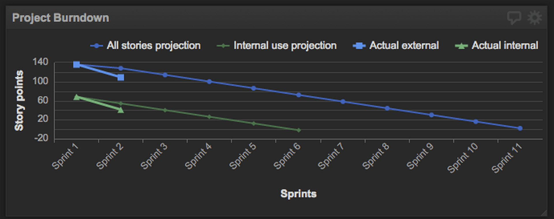
This visualization tracks the project burndown for one of our newest initiatives with a targeted release date. It is used to depict when we expect to finish the project based on the initial estimations and also to track the actual progress versus the projection. This is a very standard visualization for agile teams and can be used to track either a release or sprint. In our case, we mostly use this tool to track longer term and roadmap projects.
Action: Monitor the progress and if it is not according to the project plan, take the appropriate action (such as conduct root cause analysis, change resource allocation, and/or set the right expectations with stakeholders).
Data source: Google Drive
Release Tracker / Pipeline Kanban
Description
This Klip tracks the progress of work items through our development and release pipeline. It’s a high level Kanban board that we use to give visibility to the release pipeline on the development floor. In summary, the Kanban (Visual cards) board is used to illustrate the work items going through the production process. It is an indispensable part of the Kanban agile process. Many scrum teams also use a board to reflect the status of the work in progress. Using Klipfolio, you can obviously have as many states as you like and that make sense for your process.
Action: This Klip is mostly for the team’s awareness and to facilitate communication. This is not a metric Klip, yet it helps everyone know what’s in flight.
Data source: Google Drive
Summary and future
The metrics I covered here are mostly related to work items and project status. The main role they play is in giving visibility to the development pipeline and helping the team take appropriate action. Using Klipfolio for monitoring these metrics is really helpful as it allows us to go against multiple data sources and have one reference and place to look at for all of our metrics. There is also the added value that we are constantly testing our own tool in production and are the first ones to run into issues, if any. Furthermore, this helps us to experience any missing features that are required for monitoring use cases first hand and prioritize them on our backlog.
There are more metrics that can be monitored to help the team produce a high quality product and have a healthy development infrastructure and code base in place. At this point we are not monitoring all those metrics but here are some of the metrics that we’d like to monitor and dashboard going forward:
- Continuous integration builds fail/pass rate and their health status
- Automated / Unit tests coverage and health
- Counts of deployments to production and the associated incidents
- Number of issues found by static analysis tools
- Number of technical debt work items on the backlog
Thanks for reading. If you have any questions, please get in touch: @ali_pourshahid
Related Articles
Promoting data literacy with metrichq.org and the power of AI
By Allan Wille, Co-Founder — October 12th, 2023
Let’s fix analytics so we can stop asking you for dashboards
By Cathrin Schneider — September 11th, 2023
Why metrics are the key to confident decision making
By Graham Watts — July 31st, 2023