Meet your data mashups - 3 examples for your dashboard

Published 2023-04-26
Summary - Data mashups offer a way to combine discrete data sets together to get new, unique and actionable insights about your business. These 3 examples are only the tip of the iceberg in terms of what you can accomplish with data mashups.
We have no shortage of data available to us. In the vaunted age of Big Data, we're often awestruck (or, as I sometimes put it, "awe-struck") by the sheer volume of data out there. As many pundits are quick to point out, more data doesn't necessarily mean more insight.
Along with the size of the data, we're also witnessing an explosion in the number of data sources available to us. This is both good and bad. Good, because we're able to meticulously monitor every area of our business; bad because each service is a single piece of the puzzle that provides us a glimpse at the big picture. The key is to find a way to put all those pieces together.
Enter data mashups – A quick definition
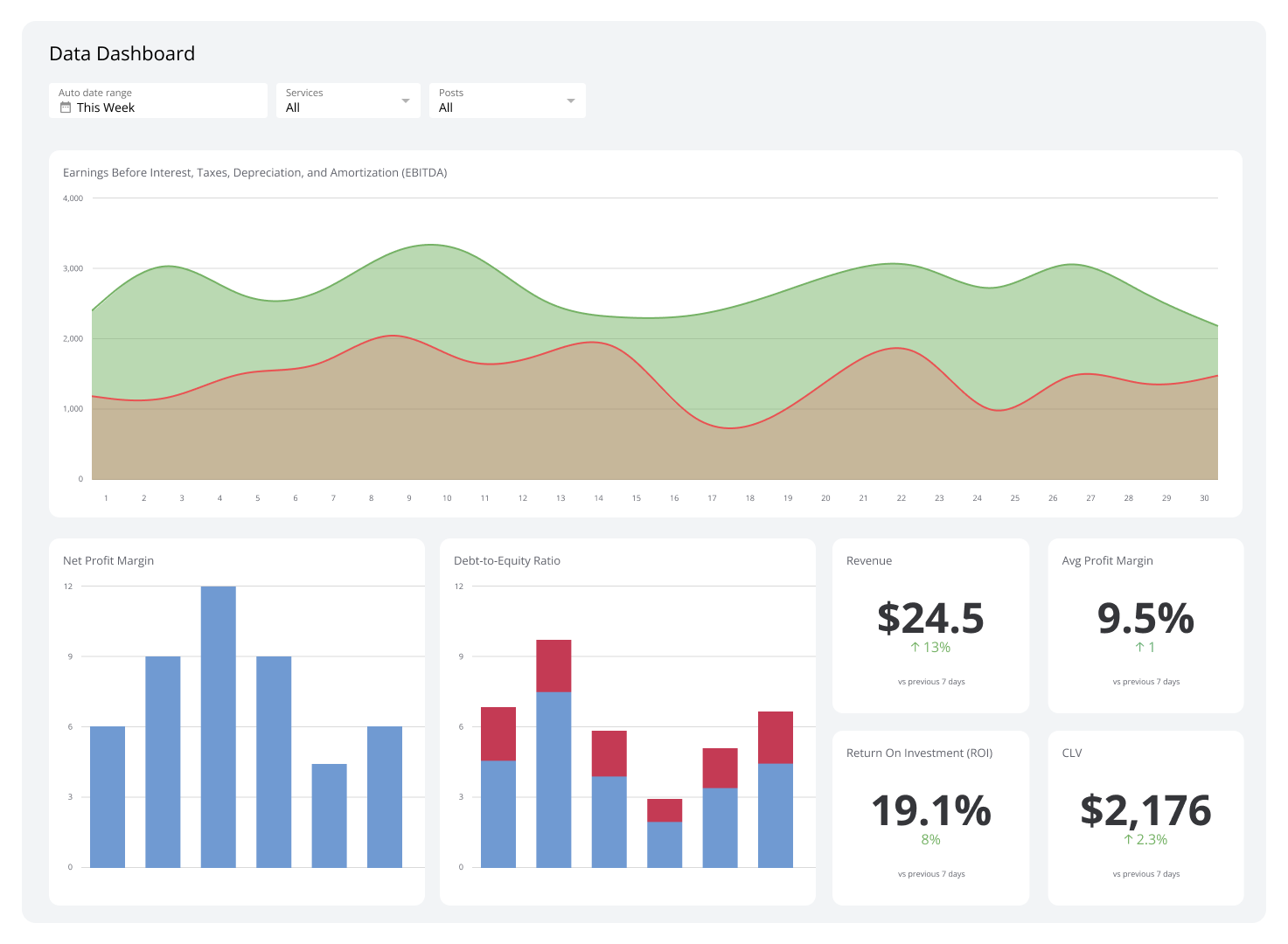
A data mashup is an integration of two or more data sets in a single graphical interface. A business dashboard is a prime example of a data mashup hard at work – most dashboards pull data from multiple, disparate sources to provide end-users with an at-a-glance view of their business performance. Of course, if you have the right tool, you can use a data mashup to create a single, unique visualization.
Example of data mashups
To give you an idea of what you can accomplish with data mashups, I've put together 3 examples for a SaaS company. Check out these examples, and let us know what you think!
Purchase Funnel
The purchase funnel is an excellent example of a data mashup. Sales and marketing teams use the funnel to monitor their customer acquisition process by measuring the number of people at each stage and examining what percentage of people move from one stage to the next. The five stages of the funnel (awareness, interest, consideration, preference, purchase) clearly necessitate pulling data from different data sources, such as web analytics and your CRM.
While some pundits believe it's time to move past the funnel, the truth is that the funnel can still be an incredibly effective tool. Basically, once you've filled in the numbers for each stage and gotten an understanding of customer flow, you can zero in on your strengths and weaknesses. Are you having trouble raising awareness and generating interest in your brand? Maybe your sales team is exceptionally good at converting prospects. You won't know until you measure.

Explanation
In this example, we've pulled data from two key sources: Google Analytics and Salesforce. I've also included a "notes" column that pulls data from a Google Drive spreadsheet to show how the team is addressing each stage of the funnel.
Social interactions and web visits
I've written before about picking the right social media metrics software and how important it is to understand how social campaigns impact your wider marketing efforts. One of the most effective ways to measure the success of social campaigns is to correlate that information with your web analytics. The problem I've encountered is that social interactions, even those that go viral, may boost traffic indirectly and increase search and direct traffic to your website.
One solution that I've tried on my social media dashboard is mapping my Google Analytics data to social interactions from key sites like Twitter and Facebook. Now, I'm not deluding myself – expecting to be able to attribute traffic spikes to viral social posts is like chasing the wind (you'll end up going in every direction). What I am interested in, however, is identifying trends and outliers.

So what I've done here is combined 3 data sources in a single chart: Google Analytics, Facebook, and Twitter. Instead of pulling referral data from Google Analytics, as you may expect, I've pulled all my visits for the given period. This allows me to quickly see the correlation between a viral post on Aug 12 and increased website traffic. Use this metric in a Google Analytics dashboard for your business.
Server response time and help desk tickets
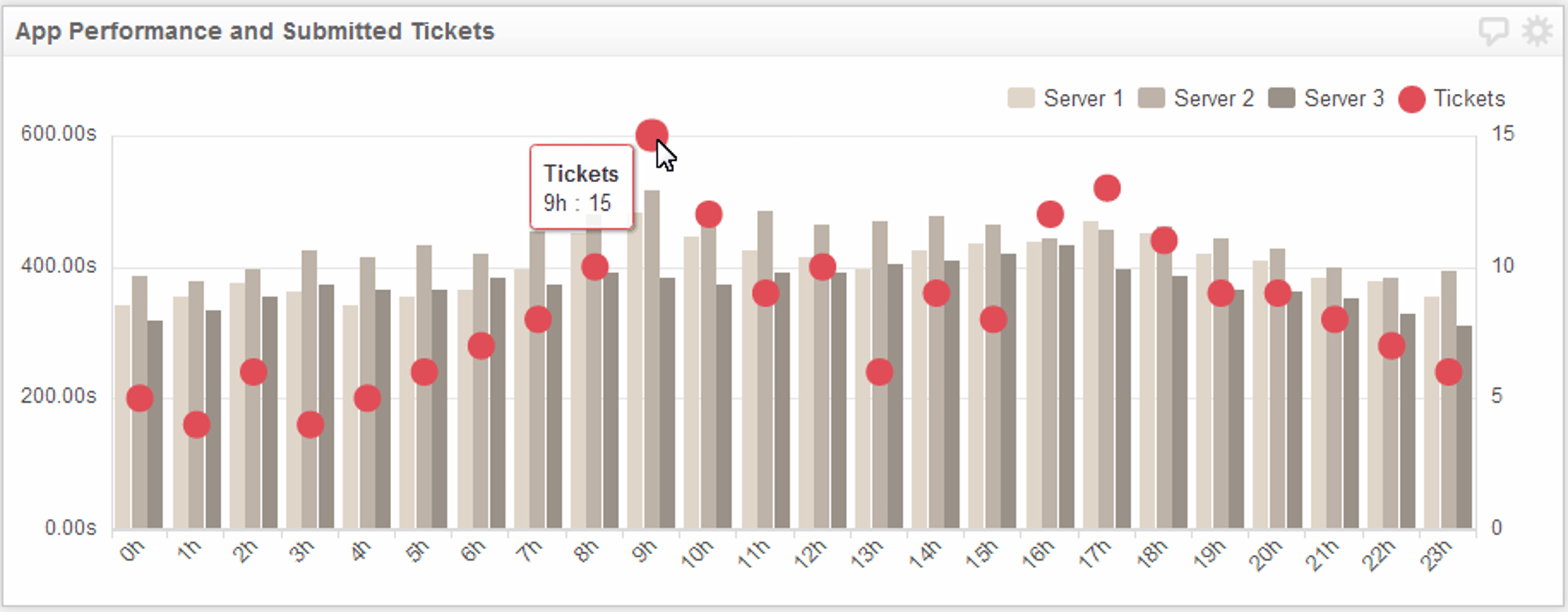
Any SaaS organization understands that there is a strong correlation between application performance and the number of help desk tickets submitted (speaking from experience, of course). If you use a service like Pingdom to monitor your web app's performance, you already have an idea of how these two sets of metrics relate. By coupling Pingdom data with data from a service such as UserVoice, a complete picture of your performance and help desk tickets begins to emerge.
For example, I was curious about the correlation between hourly application performance and when most tickets are submitted. If there is a correlation, you can adjust by ensuring help desk staff are at the ready monitoring support lines during key times or increase the number of servers and adjust load balancing.

Explanation
I've taken the average response time for each hour for the 3 servers supported by the web application and plotted it on a chart alongside the average number of tickets submitted over a 24-hour period. Not surprisingly, this exercise demonstrates the connection between application performance and submitted help desk tickets. However, this mashup also helps us to pinpoint the time "busy" times of the day, specifically 9 AM and 5 PM.
What's more interesting is that since these data sources are refreshed in real-time, you can actually watch as you improve the numbers shown. Perhaps investing in additional support personnel is your solution, or perhaps it's increasing the number of servers supporting your website. Regardless of the outcome, this data mashup answers important questions for your development and support teams.
Here are some of my favorite Klipfolio Data Mashups for building awesome dashboards
Related Articles

Klipfolio Partner How-To #1: Duplicating dashboards across client accounts
By Stef Reid — November 27th, 2025
The Starter Guide to Dashboard Design
By Emily Hayward ��— September 24th, 2025
What is a data dashboard?
By Emily Hayward — August 18th, 2025

