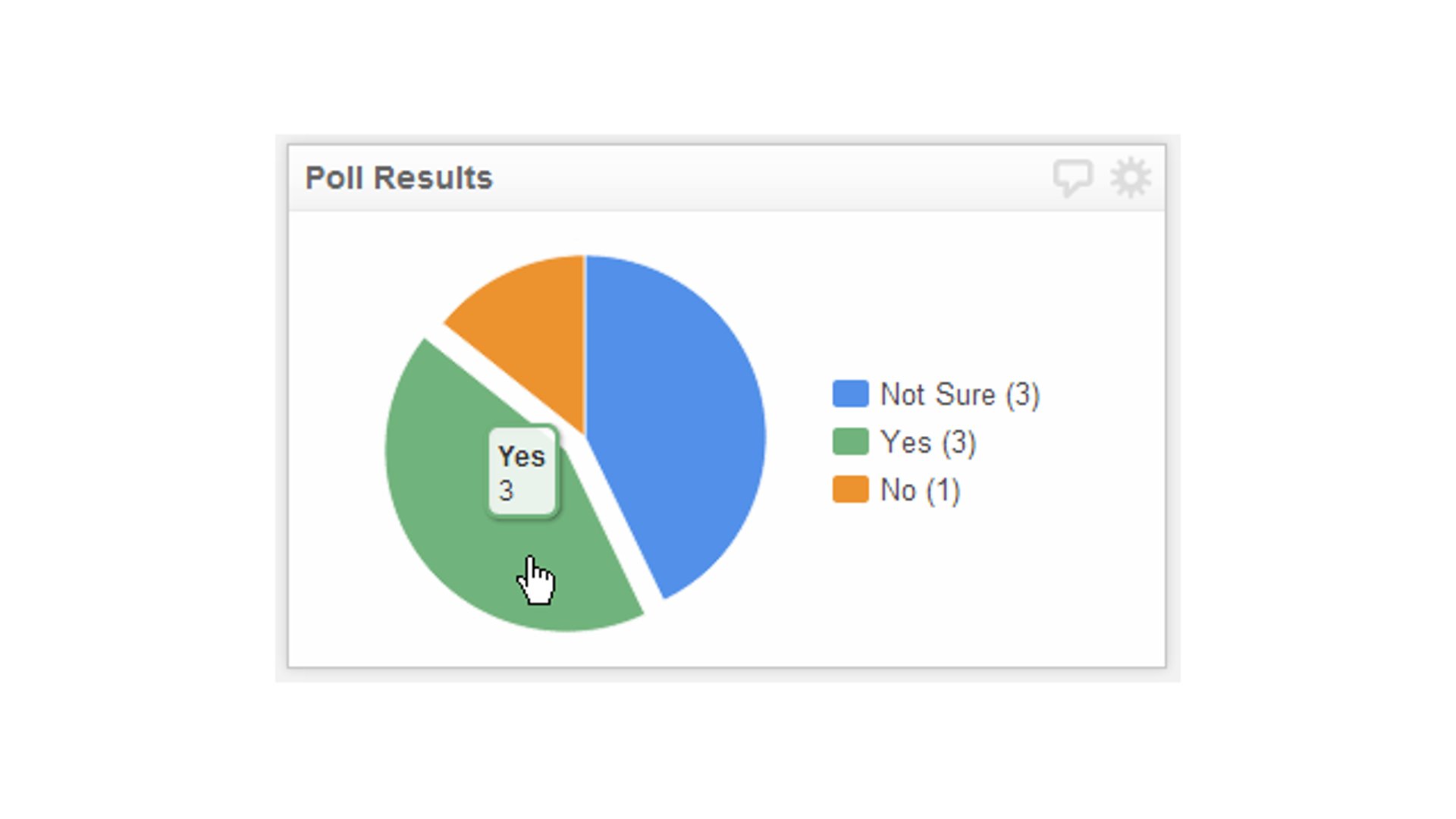
Best Practices - 3 Ways To Increase User Engagement With Your Dashboard
Published 2023-02-01
Summary - As dashboard builders, we know the importance of metrics. Here are three things you can do to increase user engagement, and go the extra mile to get the right data to the right people.
We’ve all been there. What’s my username and password? Where is that great site I saw the other day? The one with the key metrics? What’s-its-name?
With the plethora of online services competing for users’ attention every day, it’s not surprising that many people lose focus, and get out of the habit of checking in with certain services on a regular basis.
As dashboard builders, we know the importance of metrics. Through a dashboard, we’ve shone a spotlight on these for our users, but if we assume that this alone is enough, we run the risk that many will stay in the dark, or at best, only step into the light once in a while.
Here are three things you can do to increase user engagement, and go the extra mile to get the right data to the right people.
1. Make your dashboard interactive! A dashboard is a window into the here and now; it should help an organization continually track the metrics defined by your organization. A live dashboard without interactive elements, however, is merely a static image; it may have the relevant data, but users can’t slice and dice or hone in on the particular metric they’re looking for.
If you build interactive elements into your dashboard, you can allow your users to dig deep into the data, and engage with it, as opposed to merely look.
Build a drop down list where users can filter by product type, team-member, geography, or any other variable; build a date-picker where, instead of having to sift through a giant list of records, users can select the exact time period they want to see; finally, build drill down functionality into a table to summarize data, but present the detailed view beneath the surface that’s available with the click of a mouse.
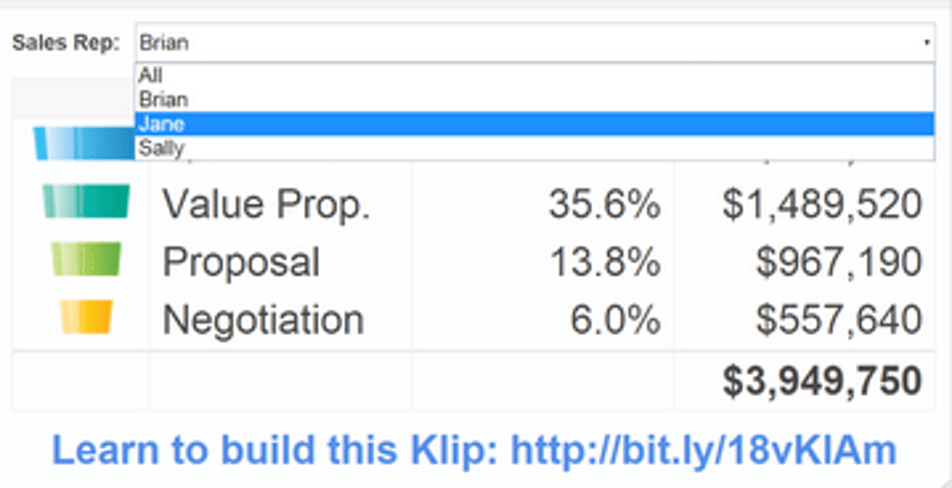
Building interactivity into your dashboard lets the user be more involved with the platform. As the saying goes: “I hear and I forget. I see and I remember. I do and I understand.”
2. Provide context and commentary. Never let your data stand alone! You could have a dashboard jam-packed with data, but if users can’t immediately grasp what it is they’re looking at, they won’t look at it for long.
If you tell me I sold 50 units this month, I’m going to ask you what I sold last month. Further, I’m going to ask you how many units my colleague sold. Preempt these questions by providing this context upfront. Use Indicators to show the status of a particularly important metric; show historical, or related data side by side with current data; use sparklines to show trends over time and save highly valuable screen real-estate along the way.


Further to context, give your users the opportunity to comment through annotations. This can spark a dialogue around what’s happening on the dashboard and allow users to participate in the discussion.
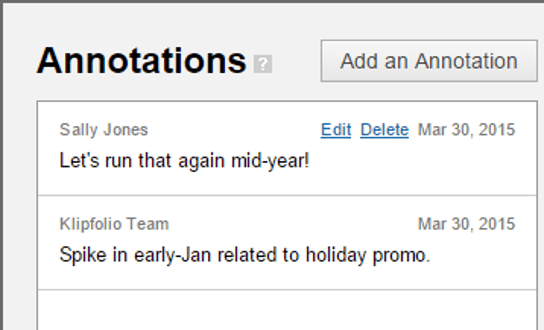
Traditional “View Only” users cannot add annotations by default, so you’ll have to add a custom role, but this is a great way to get users involved in the action. When a new user logs in, they’ll see a small indicator that someone else has commented.
3. Send reports by email. This might sound counter-intuitive. Why would I send a snapshot of a dashboard when there is a live version ready and waiting? You’re mostly right. The best experience with Klipfolio will always be through the browser, but we can use email reports to pique the interest of users, and encourage them to login.
Think of it as a teaser. Create a summary tab on your dashboard. Strip it of any metrics that go into detail. Send this report daily,weekly, or at whatever frequency you feel is appropriate, and make it clear to your users that they can get the full story anytime by logging in.
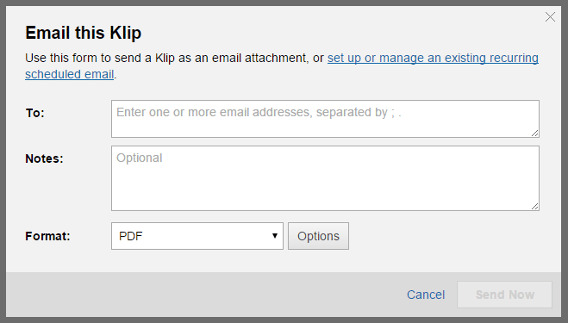
If you send too granular of a report, and send it too frequently, it will get ignored. With emailed reports, the feature set isn’t as rich, and the user experience not as high as when users login directly.
But sending a quick overview, and making users aware that they can get the full story through the app is a great tactic to increase engagement, and ensure users have access to the numbers that matter most.
A great dashboard deserves to be seen. If your users are having a hard time breaking old habits, and logging into a new platform, spend some time with them, make sure they understand what they have access to, and follow these three simple tips to get them engaged, and keep them there!
Related Articles

Klipfolio Partner How-To #1: Duplicating dashboards across client accounts
By Stef Reid — November 27th, 2025
The Starter Guide to Dashboard Design
By Emily Hayward — September 24th, 2025
What is a data dashboard?
By Emily Hayward — August 18th, 2025