
What's New
Looking for PowerMetrics updates? Click here
July 2025
Update
LinkedIn Ads Campaigns pre-built dashboard
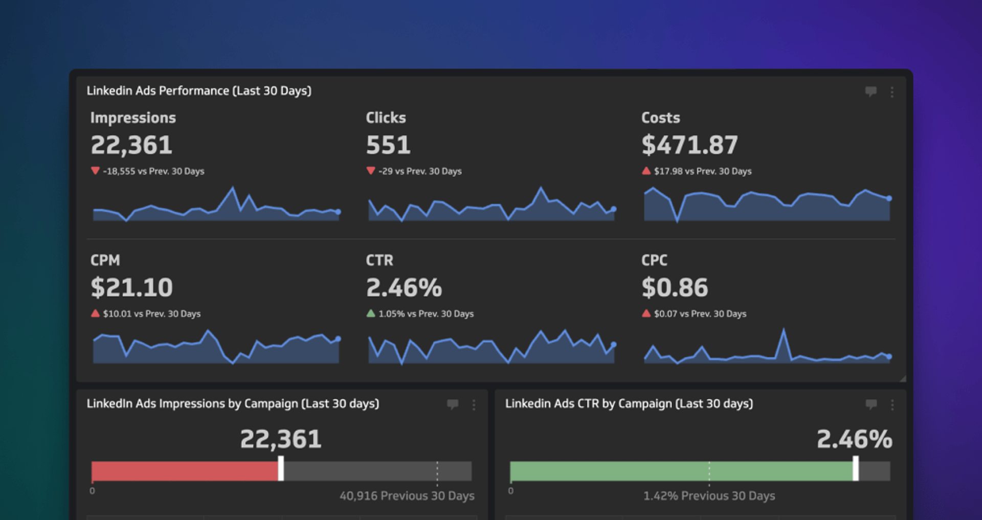
With this professionally-curated, pre-built dashboard, you’ll be monitoring the effectiveness of your LinkedIn Ads campaigns in no time flat!
Learn moreApril 2025
Improvement
Better dashboard control
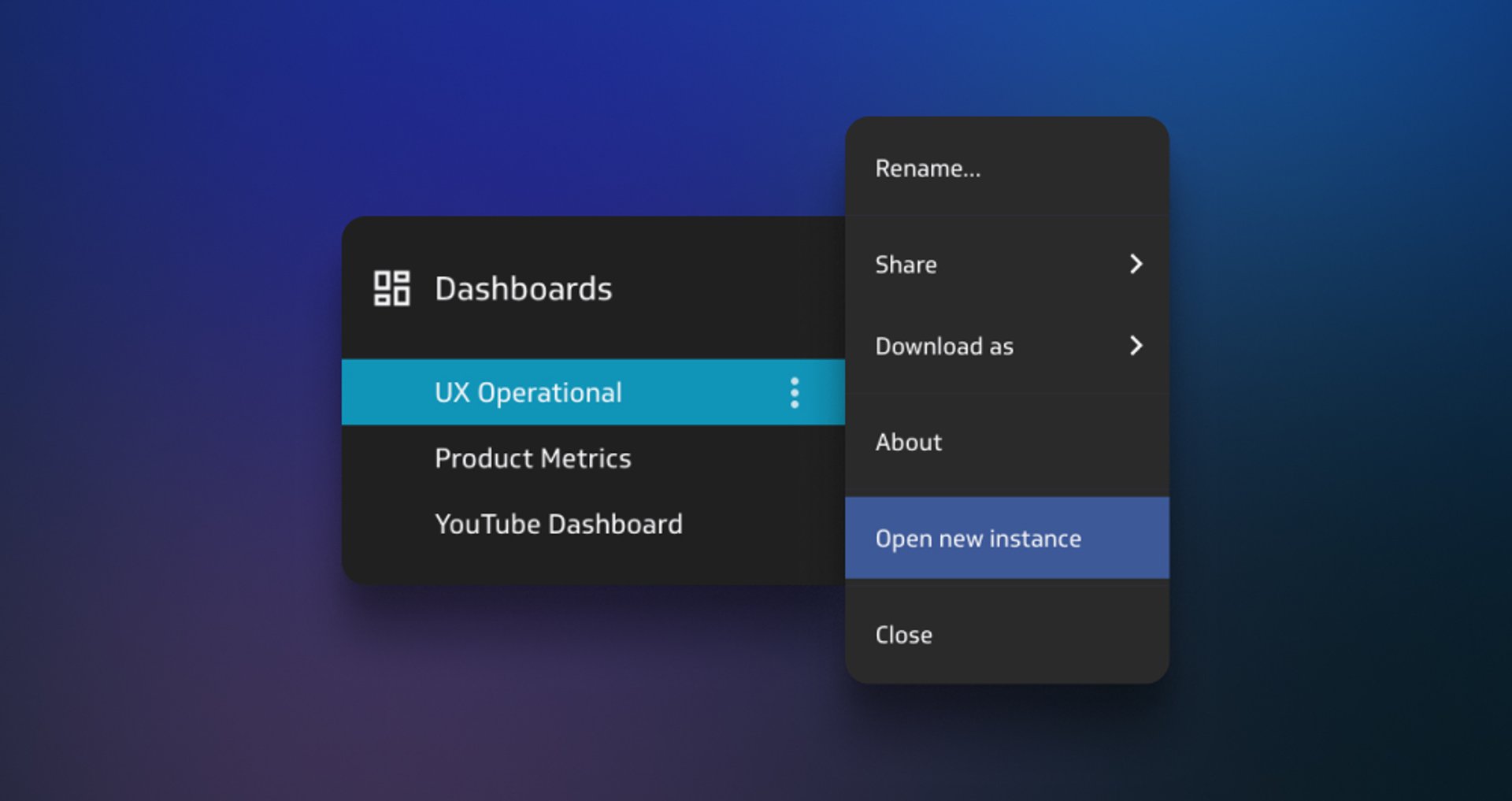
Adding instances to your list of open dashboards is now more intentional, removing the risk of duplication and clutter in your list of go-to dashboards!
Learn moreMarch 2025
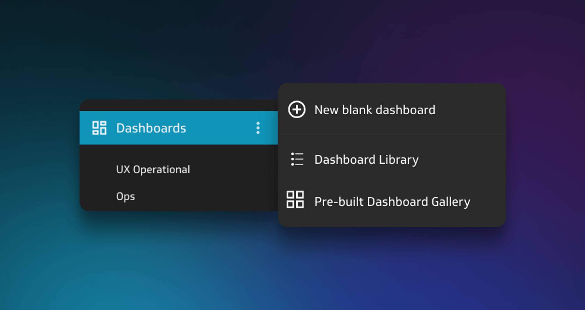
New Feature
Pre-built Klip dashboards
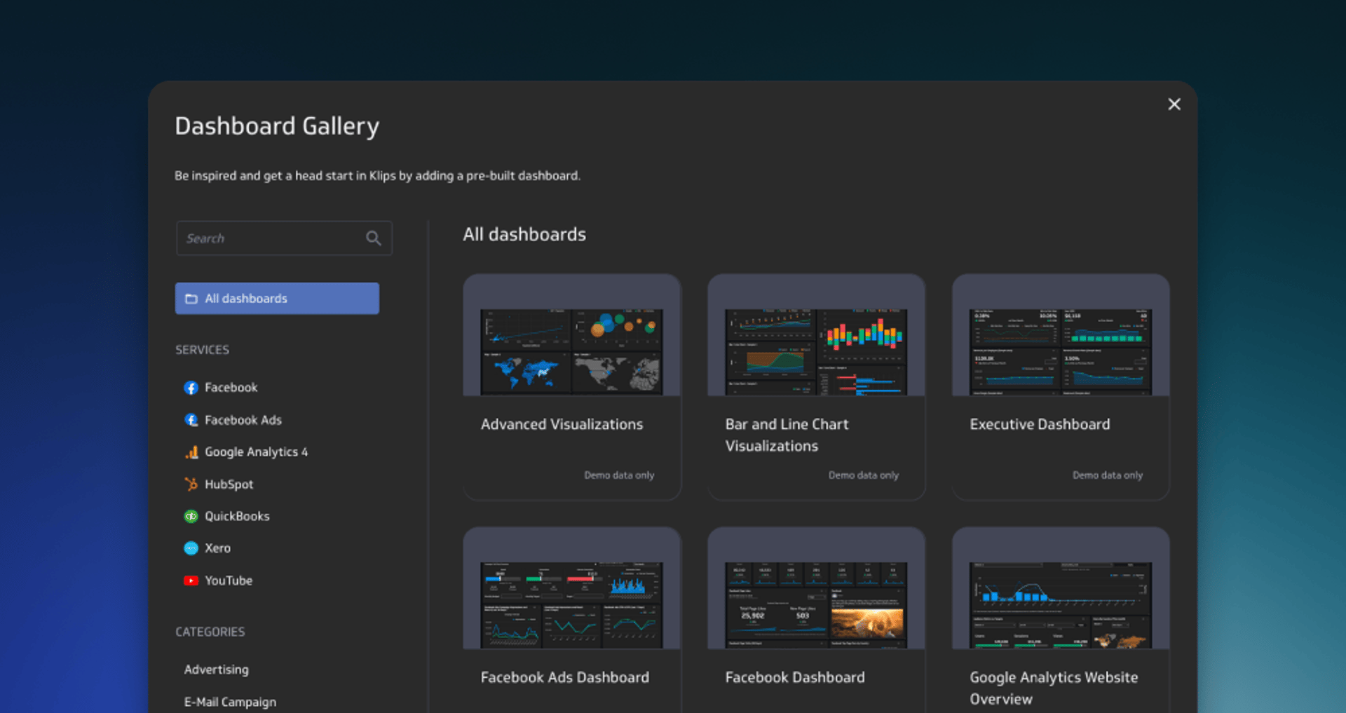
Instantly add curated dashboards that bring together essential Klips for Finance, Marketing, Social Media, Web Analytics and more!
Learn moreImprovement
Get there faster!
Update
Redesigned mobile experience for Klips!
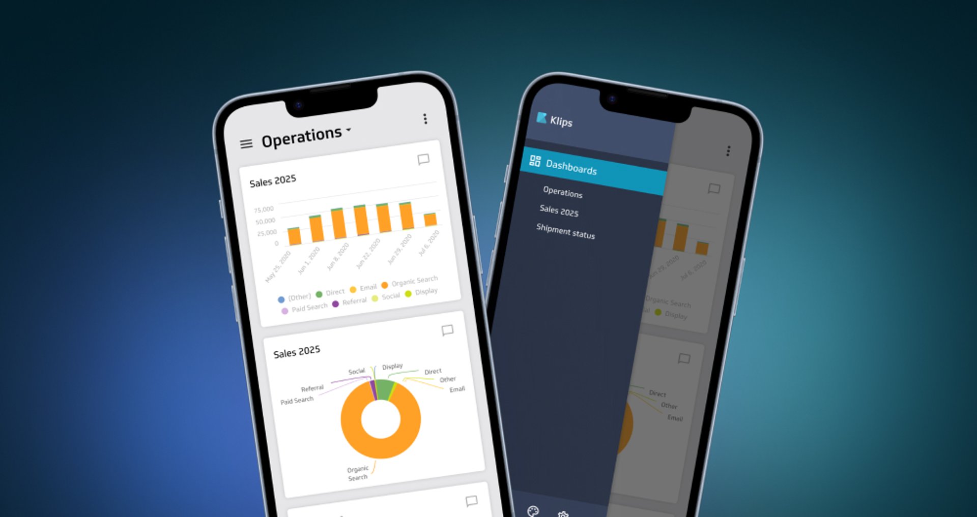
Get instant, on-the-go access to dashboards on your smartphone.
Learn more
Update
Custom theme
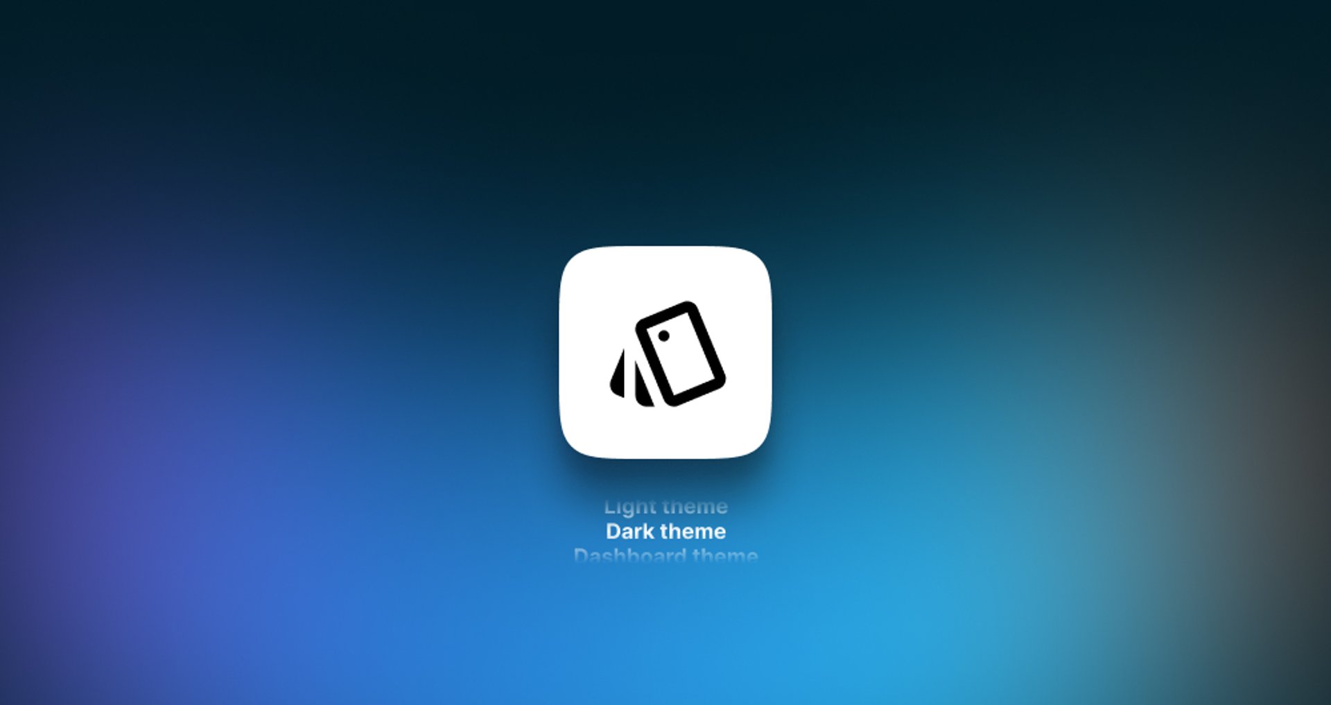
You can now apply customized styling to the left-navigation sidebar in Klips.
Learn moreUpdate
Connecting to your Zoho data

In response to recent changes in the Zoho service, we now have separate built-in connectors for Zoho Desk and Zoho CRM.
Learn more